

How to Use the AutoLayout and GridLayout: Swift Cross-platform Native Apps with SCADE


SCADE works with a wide range of screen sizes because it is a cross-platform app development framework. Adapting an app project to a wide range of screen sizes and pixel densities while maintaining the same codebase has always been a source of concern for developers. This is one of the major issues that SCADE has successfully recently developed a solution for.
Developers can quickly organize all types of controls precisely on a mobile app page owing to the versatile layout manager incorporated into SCADE. The layout manager in SCADE adapts to the respective screen size dynamically, resulting in device format independence. The layout manager uses layout containers to show mobile pages.
There are no fixed or definite rules to follow when designing a responsive layout in SCADE. This tutorial aims to show you some approaches you may use to build a layout for your next app project.
However, before moving on to building responsive layouts in this chapter, let's take a look at some of SCADE's most significant general layout properties.
By the end of this tutorial, you'll be able to develop basic SCADE apps that employ the AutoLayout and GridLayout techniques to accommodate variable screen sizes and pixel densities.
Getting Started
SCADE uses the following concepts to define responsive layouts:
AutoLayout
AutoLayout allows you to create responsive interfaces by defining rules (also known as constraints) that manage the content in your app. When specific environmental variables (known as features) are discovered, AutoLayout automatically readjusts layouts according to the set limits.
Common AutoLayout Properties
- Bounding box: A bounding box is a crucial layout feature. It's simply a rectangle that encloses and specifies the area in which visual controls (button, label, vertical and horizontal layout containers, textbox, and so on) can be positioned.
- Height: The height attribute is used to specify how much vertical space a widget takes up in a display.
- Width: The width property determines the amount of space a widget occupies horizontally in a layout.
- Vertically-In-Container: It aids in the vertical centering of a widget within a layout configuration.
Horizontally-In-Container: It helps in the horizontal centering of a widget in relation to a layout configuration.
Here, for example, we'll constrain a button and a label to be horizontally centered with an Image control, with the button's top edge and the label's bottom edge always remaining 8 points below and above the image control's bottom and top, respectively. When the size or position of the image control changes, the position of the button and that of the label also automatically adjust to match.
See the Screenshots below as a Guide:
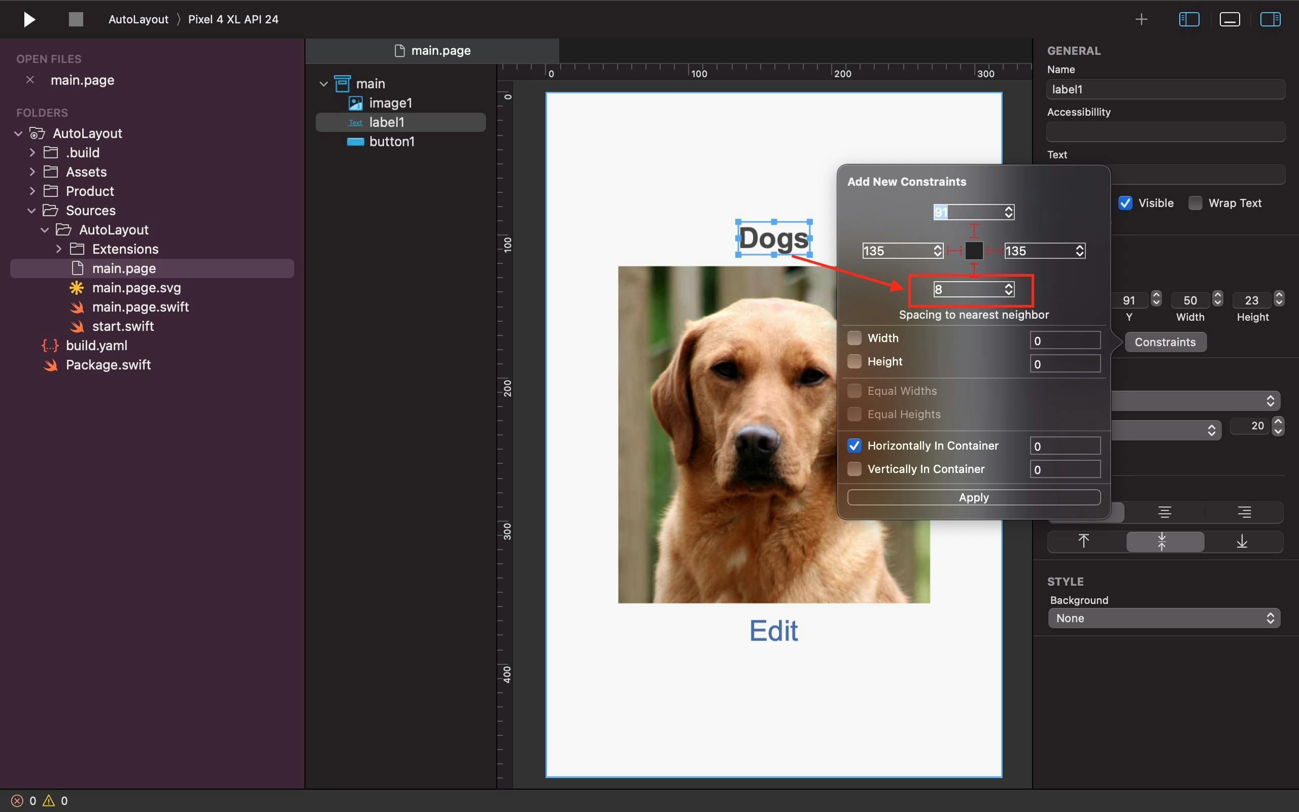

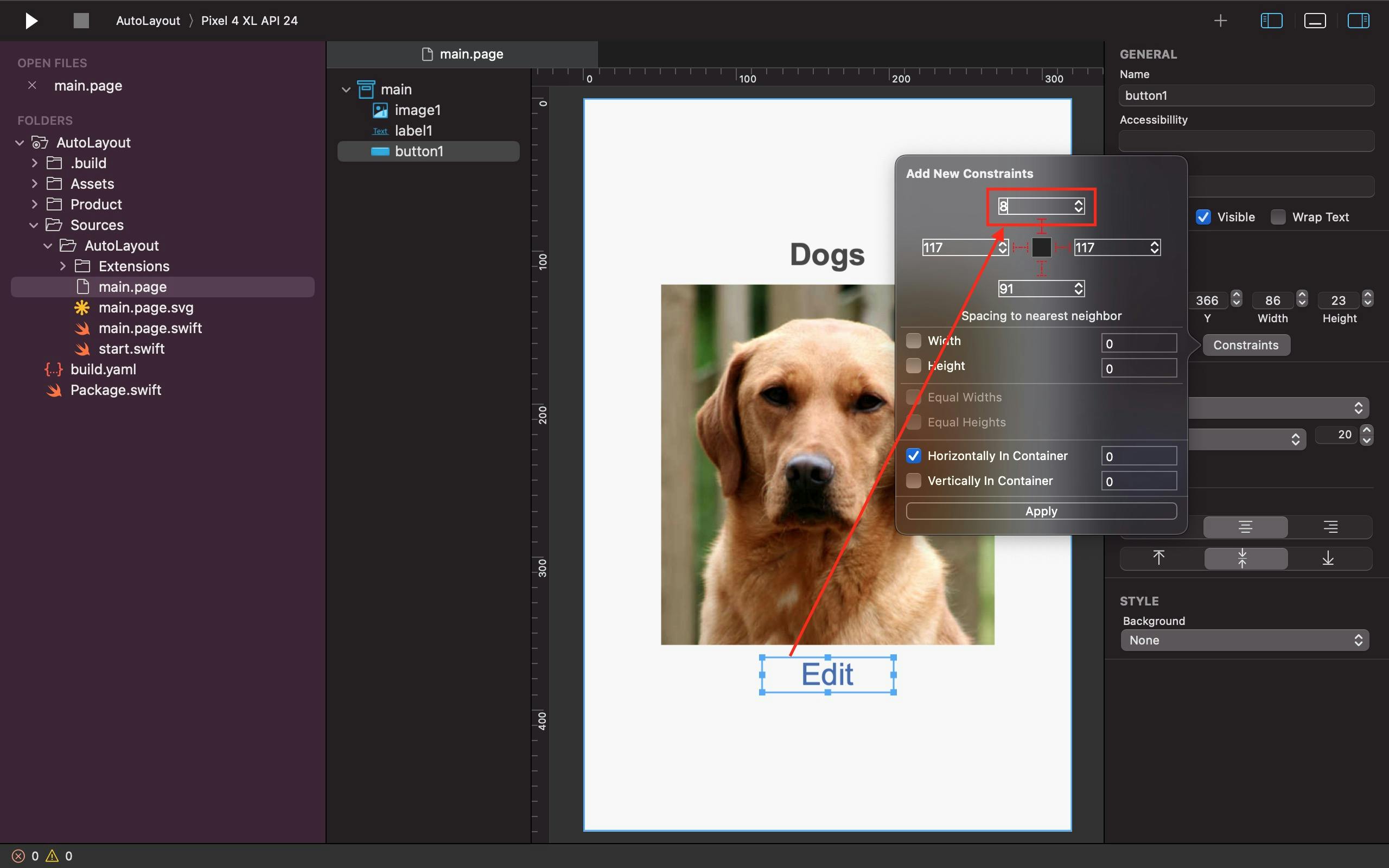
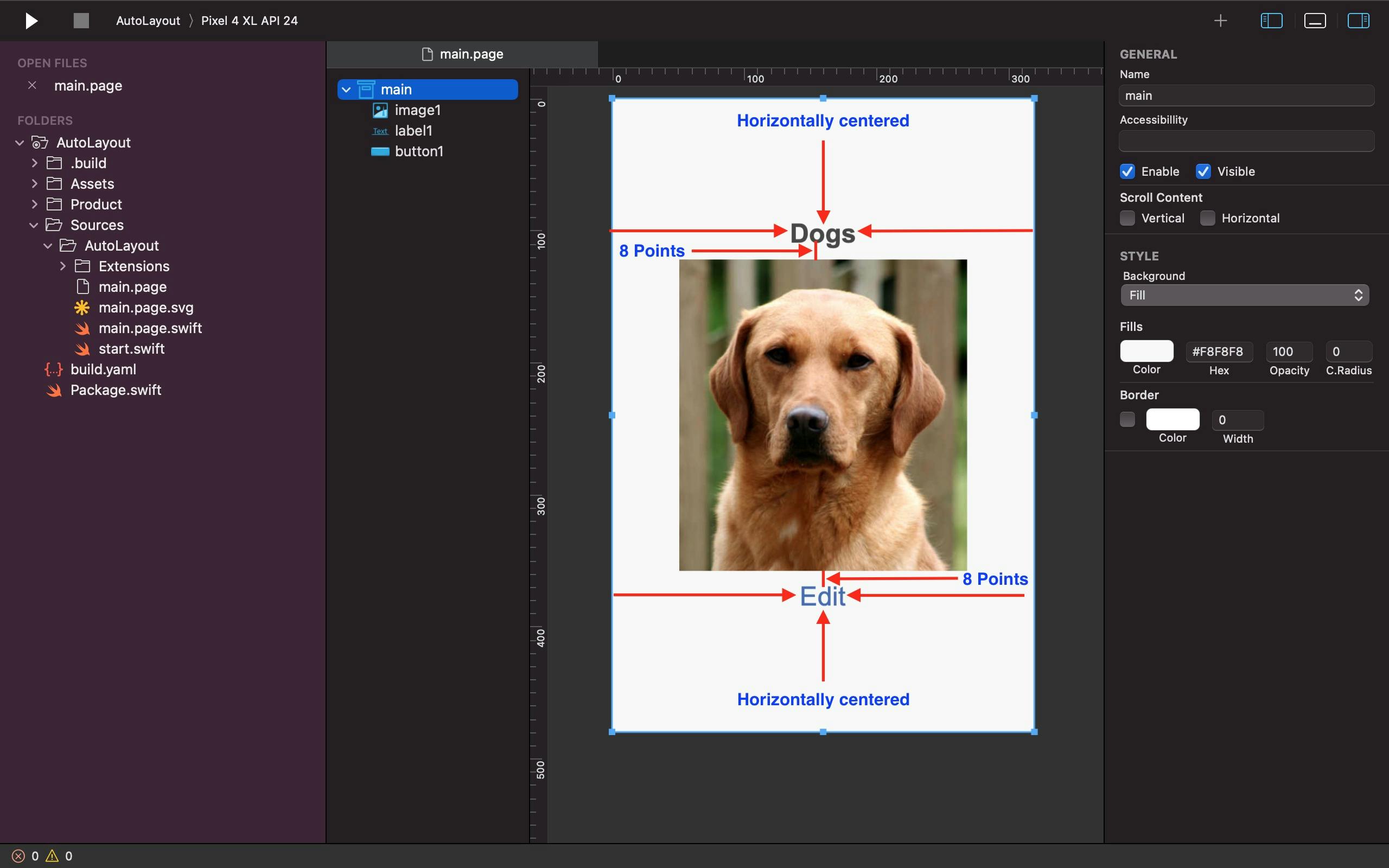
The constraints of each control are configured as shown in the screenshots above to meet desired positions and distance between controls. The topside of the button control is set to 8points below the image control. While the bottom end of the label control, on the other hand, is also set to 8points above the image control.
Note: Also in AutoLayout we can change widgets' location and size using D'n'D or bounds from general properties - not only constraints
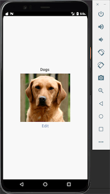
Output:
GridLayout
The Grid Layout organizes the items in the layout in a grid-like fashion. Other layout containers or user controls such as buttons, labels, and list controls just to mention a few would fit in perfectly as an item in a Grid Layout.
Most importantly, this particular layout renders items in both horizontal and vertical orientations. A grid is made up of several rows and columns. If new items are added, the grid increases dynamically.
A grid can include at least one control in each cell (bitmap, label, button, etc.). However, you may have a cell hold many controls by adding another layout container (listView, rowView, etc.) into it. The tallest control in each row of a grid determines the height of each row. The widest control in each column determines the column's width.
Common Properties of a GridLayout
- Margins: The margin parameters determine how much space exists between the layout container and the content it holds. The container's content is pushed inwards when there is an increase in the margin property. The numbers are absolute values expressed in points.
- Rows: For vertically setting an item or controls.
- Columns: For horizontally configuring an item or controls.
- Row Spacing: It's unique to the GridLayout, and it's primarily used for horizontal spacing within containers.
Column Spacing: It's also in the GridLayout, and it only supports vertical spacing within a container.
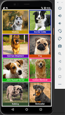
For instance, the GridLayout tutorial in this section is set up with 4 rows and 2 columns. Each cell in the layout comprises a bitmap and a label, with the label displaying the dog's breed name.
See the Screenshots below as a Guide:
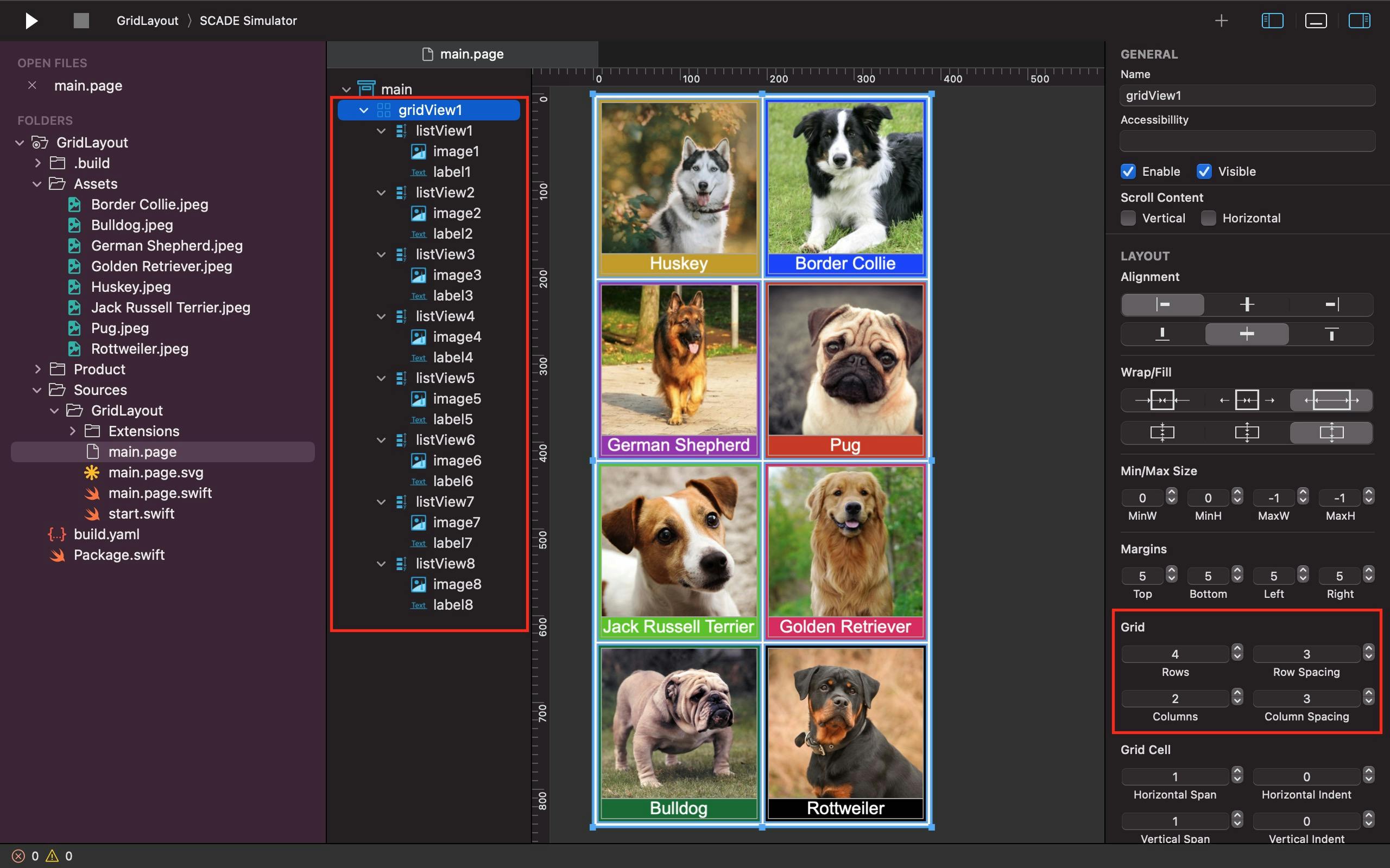
As you can see in the above screenshot, we made the label display at the bottom of the vertical container, regardless of how high the bitmap is. We configure every bitmap in the above grid to extend vertically and take up about 4/5 of the available space in each cell, whereas the label is pushed to the bottom of the cell and takes up just 1/5 of the available space. Not to mention that we used the Background attribute to set the background color of each cell to a variety of colors that we liked, as well as setting the row and column spacing to 3 to achieve horizontal and vertical separation between cells.
Output:
Conclusion
We have essentially learned how to use AutoLayout and GridLayout in SCADE. However, AutoLayout and GridLayout are not limited to the layout formats discussed in this guide; there are a variety of additional approaches to accomplish the same goal. The source codes for these tutorials are available on Github: AutoLayout and GridLayout.