How to build Login Screen for a Native Cross-Platform Swift Application


In software application development, user acquisition and authentication are critical, and you'll require UI screens to do so. Login screens are used to authenticate users before granting access to websites, mobile apps, and computer applications to prevent unauthorized access to confidential information.
In this tutorial, we are going to be learning how to build a login page user interface with the grid layout in SCADE.
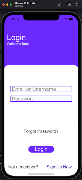
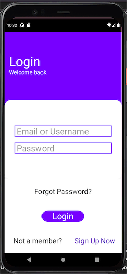
The aesthetic features of the login screen we're going to build here are simple. First, there are two label widgets showing that this is a login page and welcoming users back, respectively. Next, we have two textfields: email or username and password, to get login credentials from users. Then we have another button widget for the Forgot Password. After that, there is a third button widget for the Login button. If the user does not have an account, there should be a provision for the Sign-up process, hence lastly a Sign-Up-Now button.
Getting Started
Step One
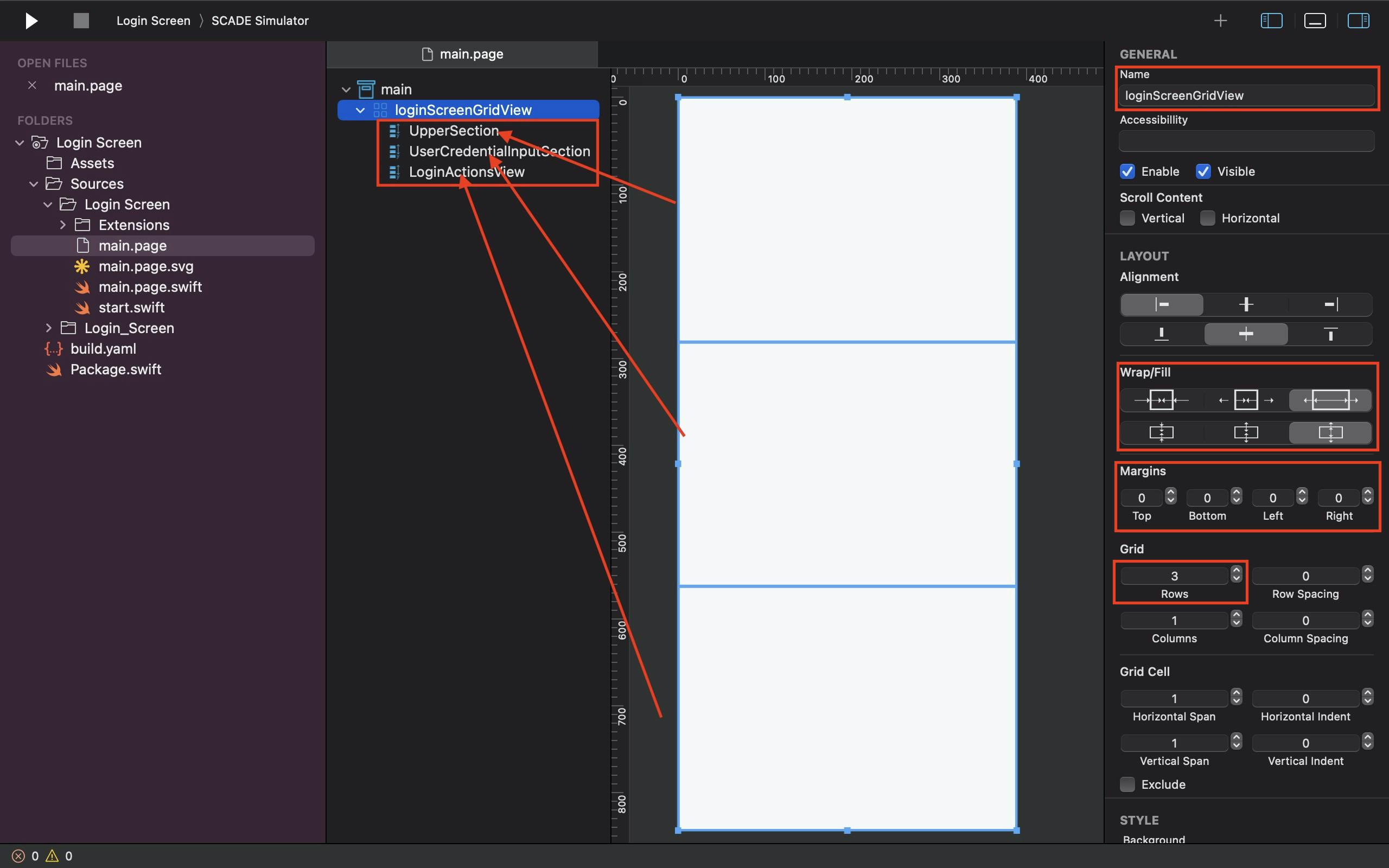
Drag and drop the Grid layout onto the main page. Give it a name and divide it into 3 rows.
Depending on how you want the feel and look of your page to be, you can place either of or a combination of the vertical, horizontal, or gridlayout containers inside the configured 3 rows mentioned above.
For instance, we have the one used for this tutorial named loginScreenGridView and place inside it 3 vertical containers: the UpperSection, UserCredentialInputSection and the LoginActionsView.
Also, ensure you configure the GridLayout Fill property in a way to have your login UI take full advantage of your device screen, and never forget to set margins in all directions of the Grid to zero as we have done for this tutorial.
See the Screenshot below as a Guide:
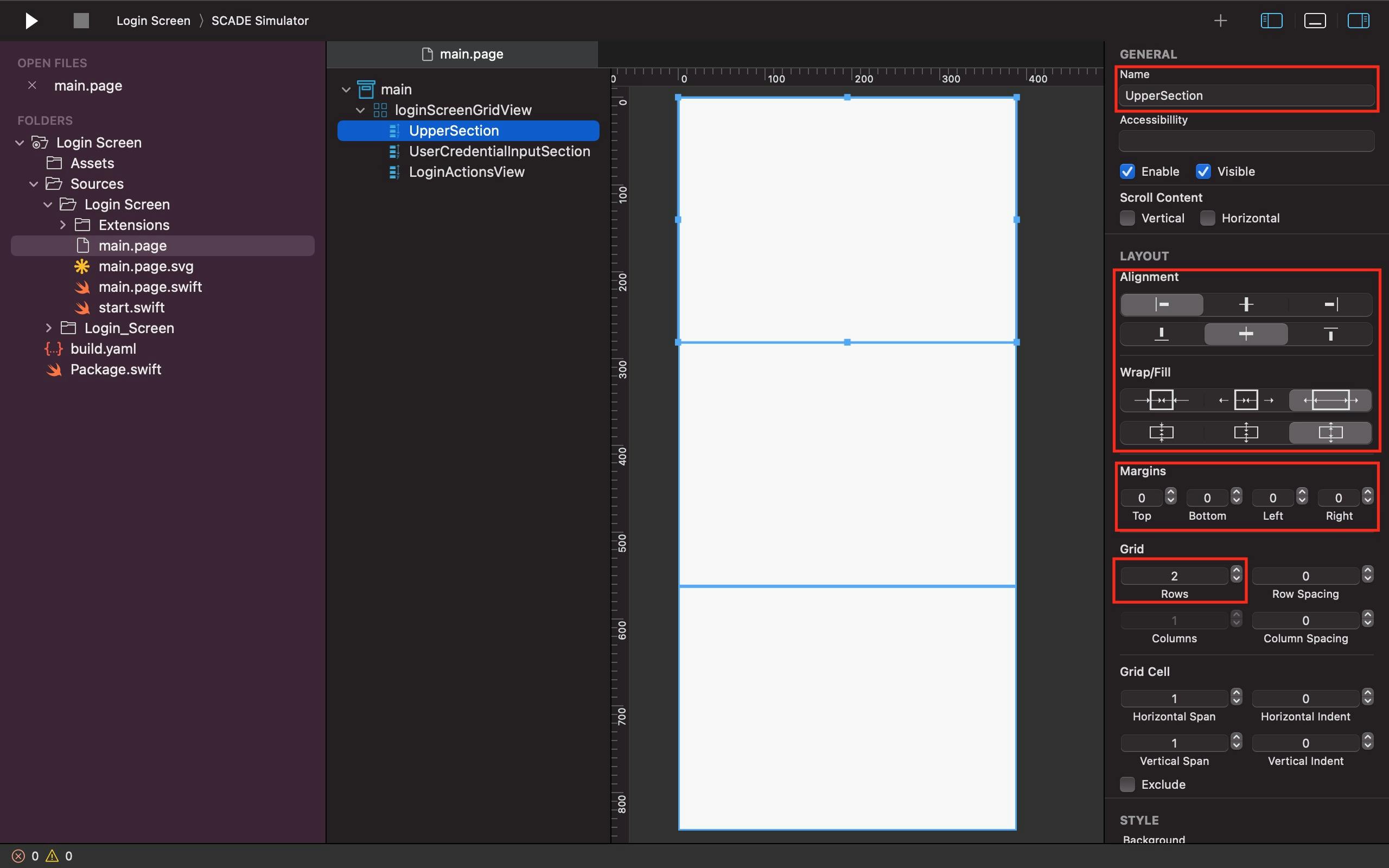
Step Two: UpperSection
Since we've already placed a vertical container within the first row and named it the UpperSection for the simple login page we're building, the next task is to:
Adjust the UpperSection's Alignment property such that it fills the entire available space in the row.
Make the margins at the top, bottom, left, and right zero.
Ensure the UpperSection has two rows as well.
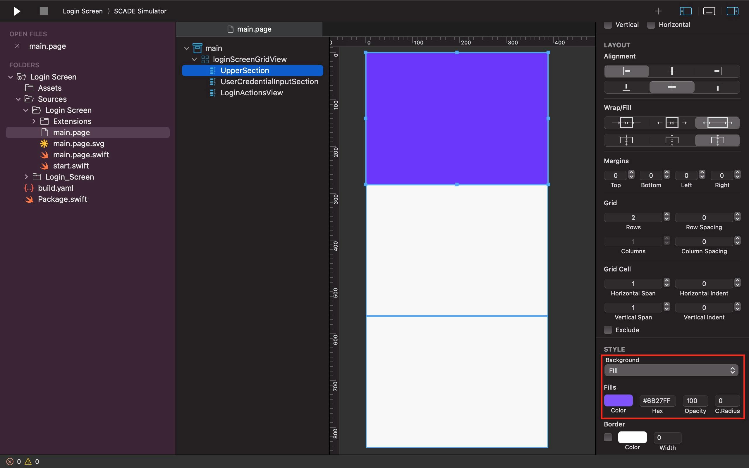
Let it have a fill background color as well.
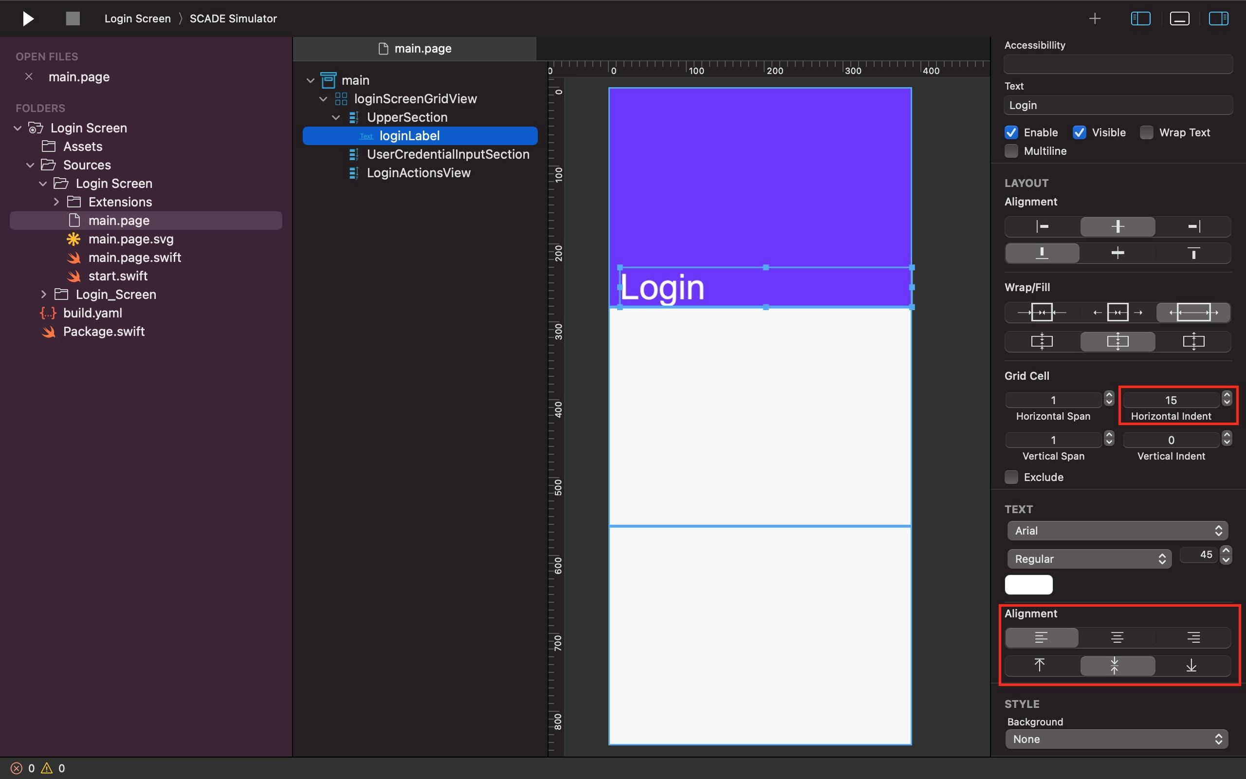
Name the first label widget loginLabel and position it within the first row of the UpperSection container with a Login text value typed on it. Keep in mind that the Alignment attribute of the label widget determines where it appears inside the vertical container. For instance, the Alignment attribute causes the loginLabel to fill the bottom of the first row in the UpperSection container.
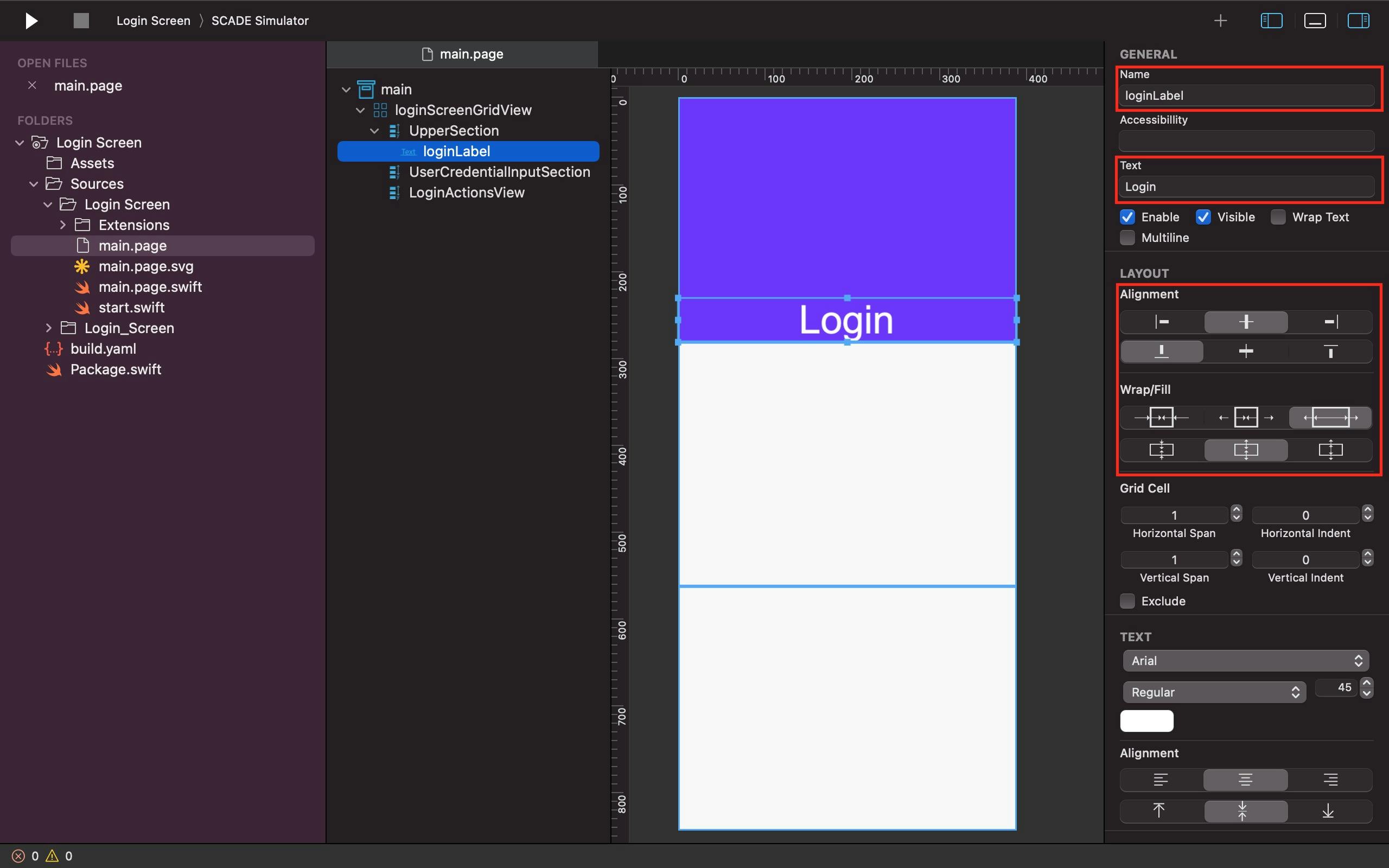
We also use the TEXT property's Alignment feature to move the Login text value to the left-hand side of the label, with a 15-point Horizontal Indent added to give it some left margin.
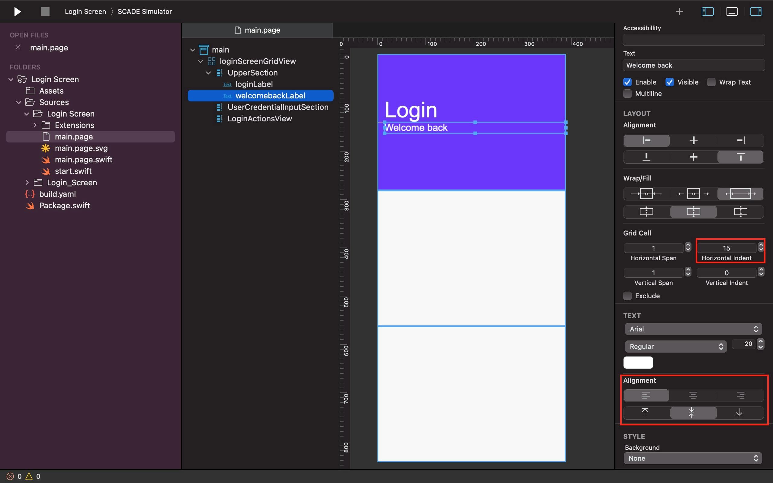
Unlike the loginLabel, we filled the top of the second row in the UpperSection container with the designated welcomebackLabel.
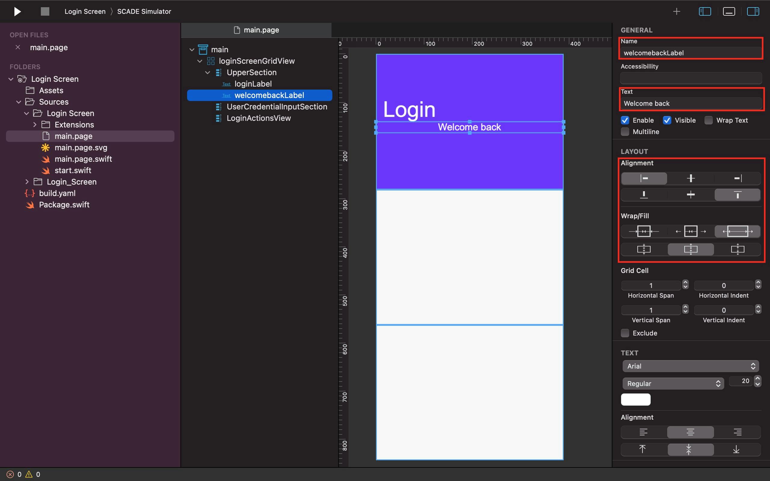
However, its text value (Welcome back) is moved to the left-hand side of the second label, with a 15-point Horizontal Indent given to it, so it can have a little left margin like the loginLabel directly above it.
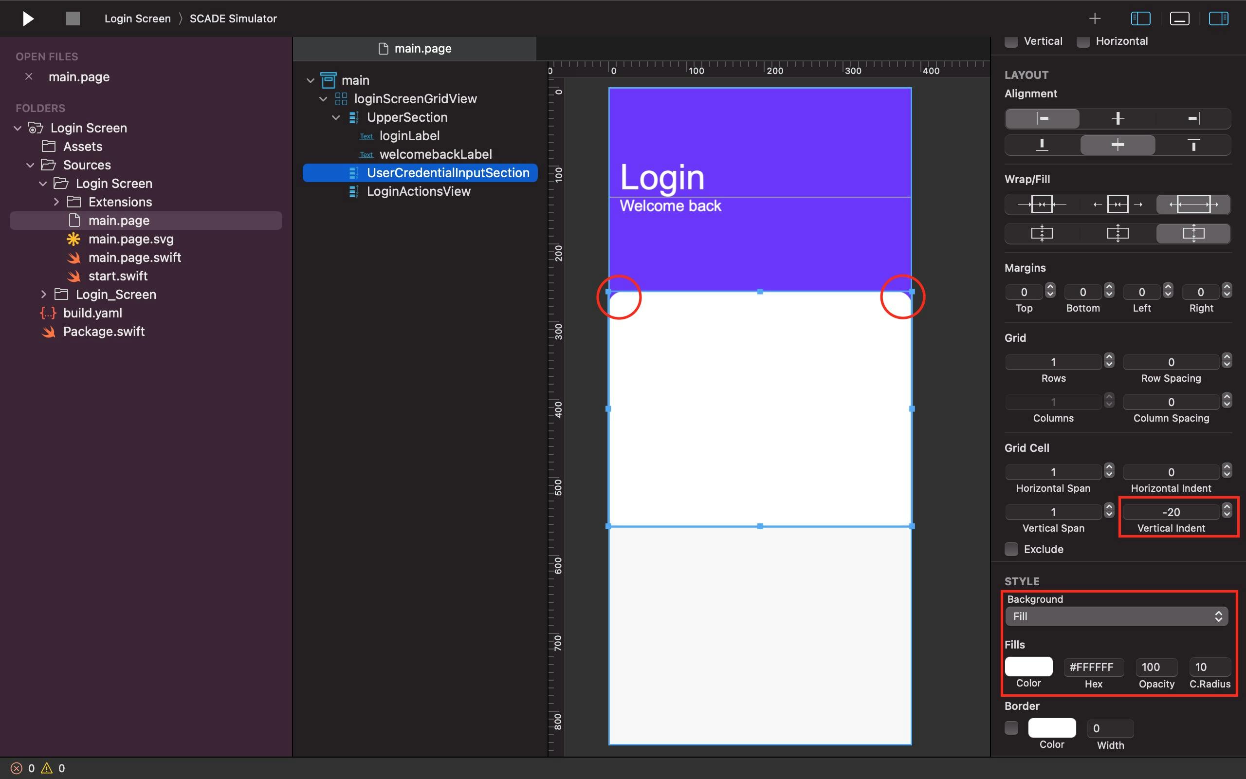
Step Three: UserCredentialInputSection
Then, in the loginScreenGridView's second vertical container (known as the UserCredentialInputSection), do the following:
Use the fill property of the UserCredentialInputSection to ensure that it takes up the most vertical space.
Just like the UpperSection container, set the top, bottom, left, and right margins of the UserCredentialInputSection container to zero.
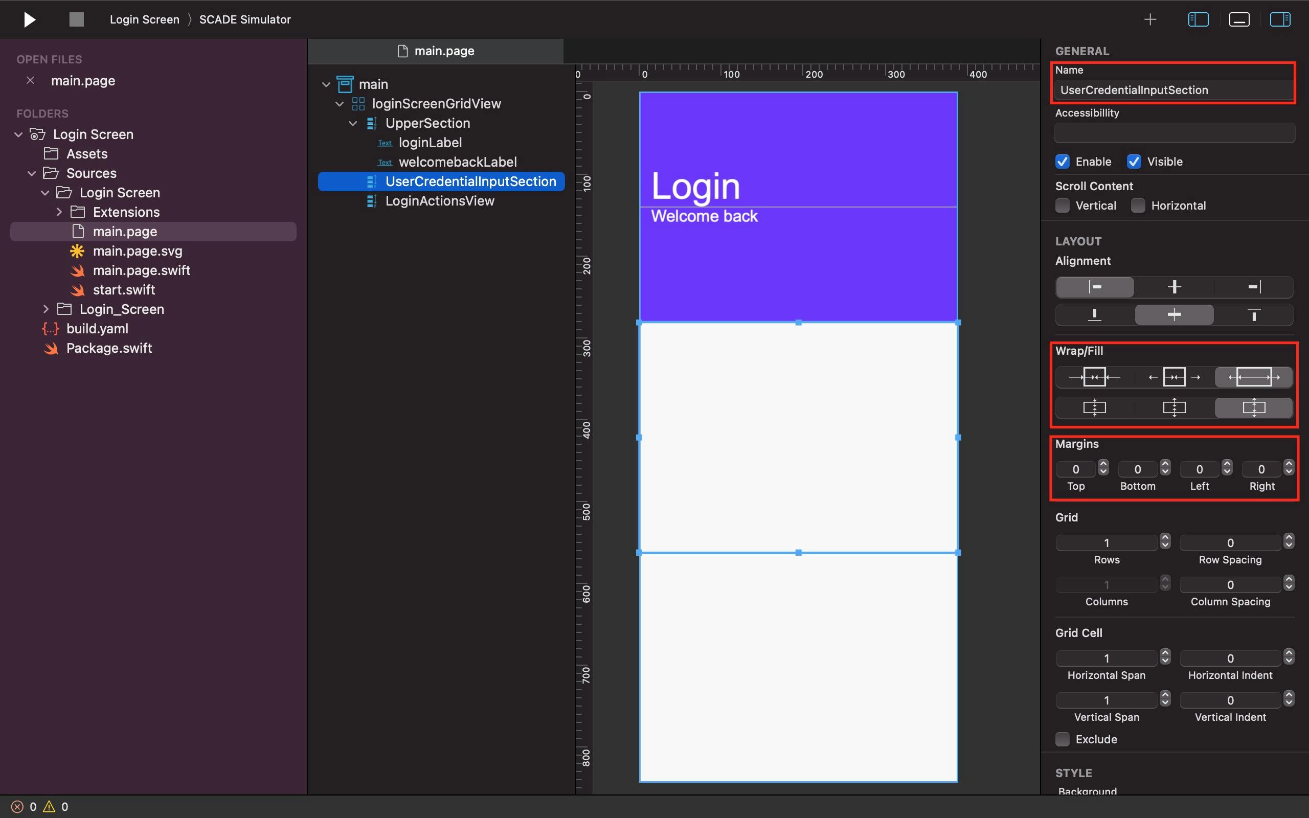
We wanted the second vertical container (UserCredentialInputSection) to overlap the first vertical container (UpperSection) so we set the background color of the former to white and set its vertical indent to -20. We also adjusted its circular radius to 10 so it can have a curved edge.
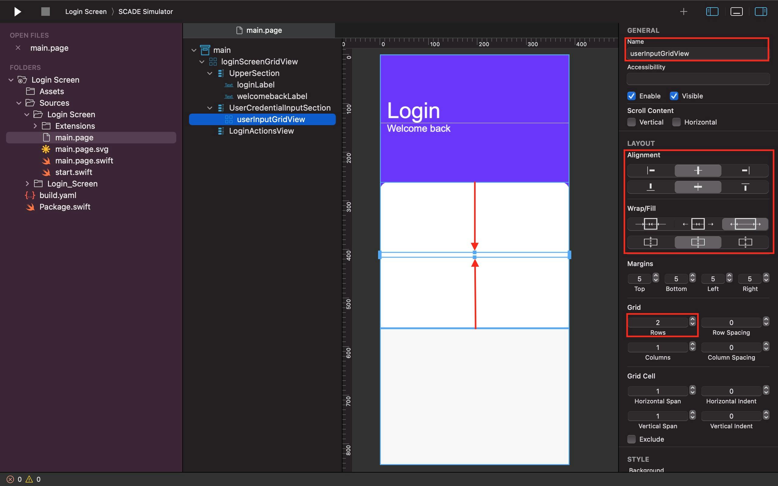
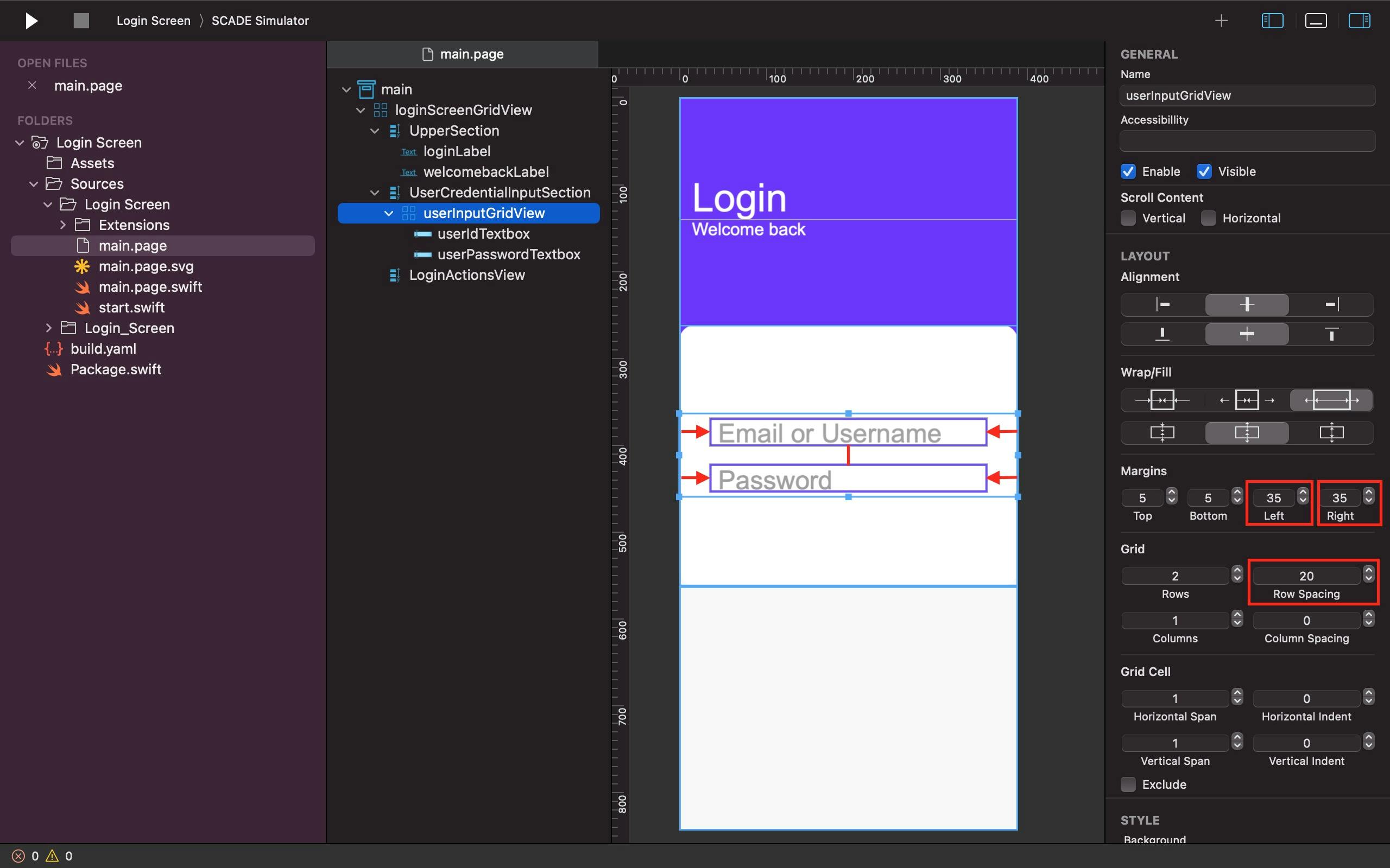
Add a gridlayout container and call it userInputGridView within the UserCredentialInputSection container. We used its Alignment property to have it centered in the UserCredentialInput container. Not only that, but owing to its fill attribute, we made sure it took up the most horizontal space while being constrained to a certain amount of space vertically. Not to mention the fact that we divide it into two rows to accommodate the userId and userPassword textboxes for user input.
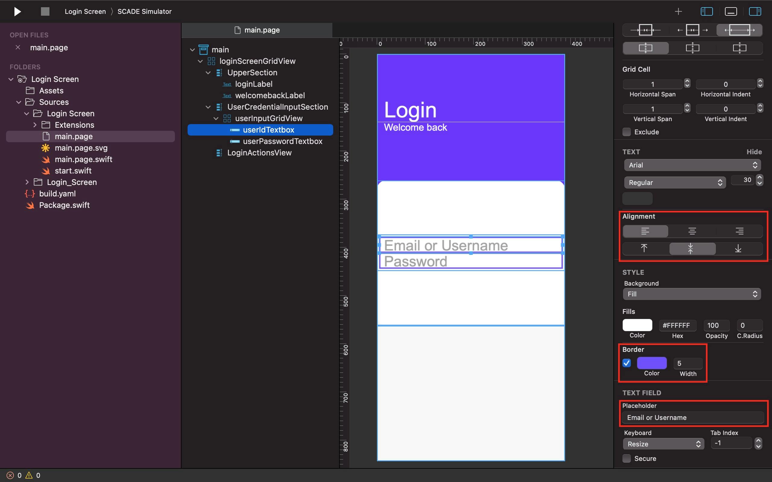
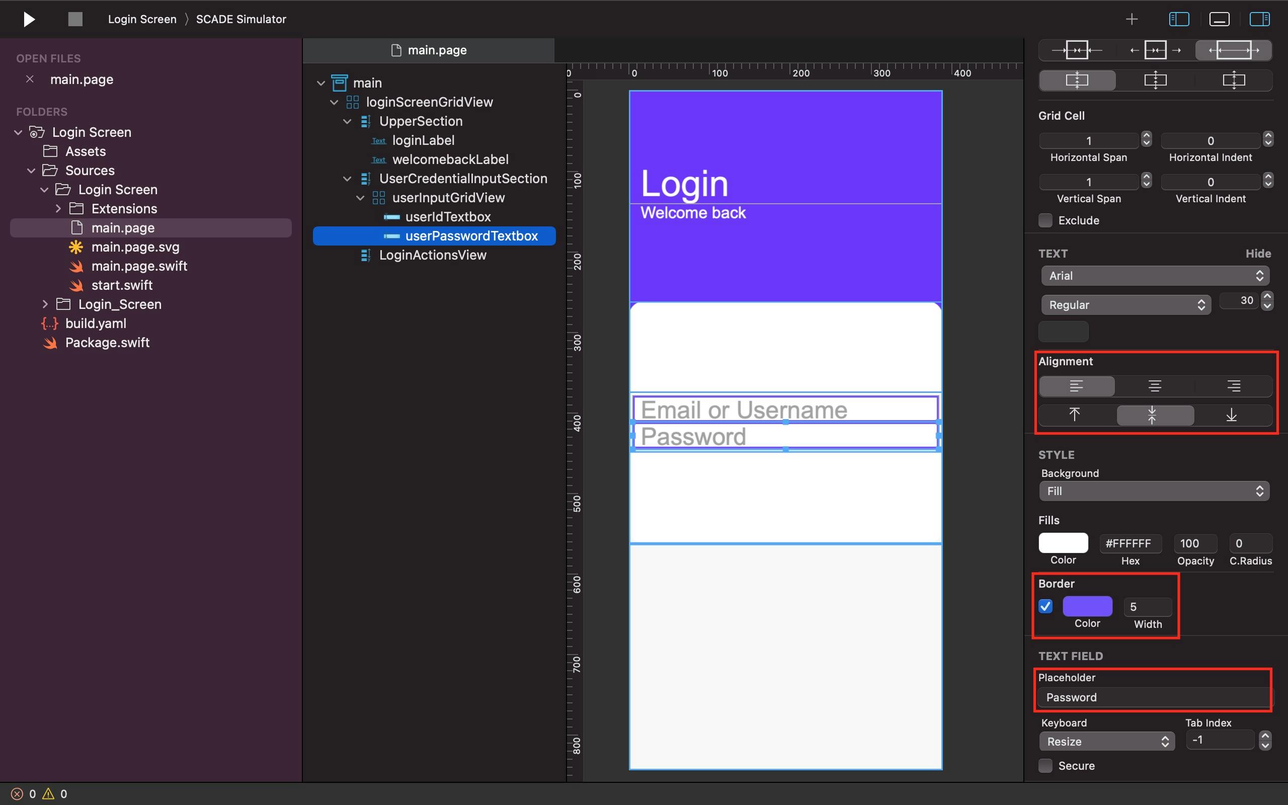
Then use the Textbox widget for Email or Username and Password. Assign the names userIdTextbox and userPasswordTextbox to the two textboxes, accordingly. Use the Fill property to specify their sizes and positions in the userInputGridView.
See the Screenshots below as a Guide:
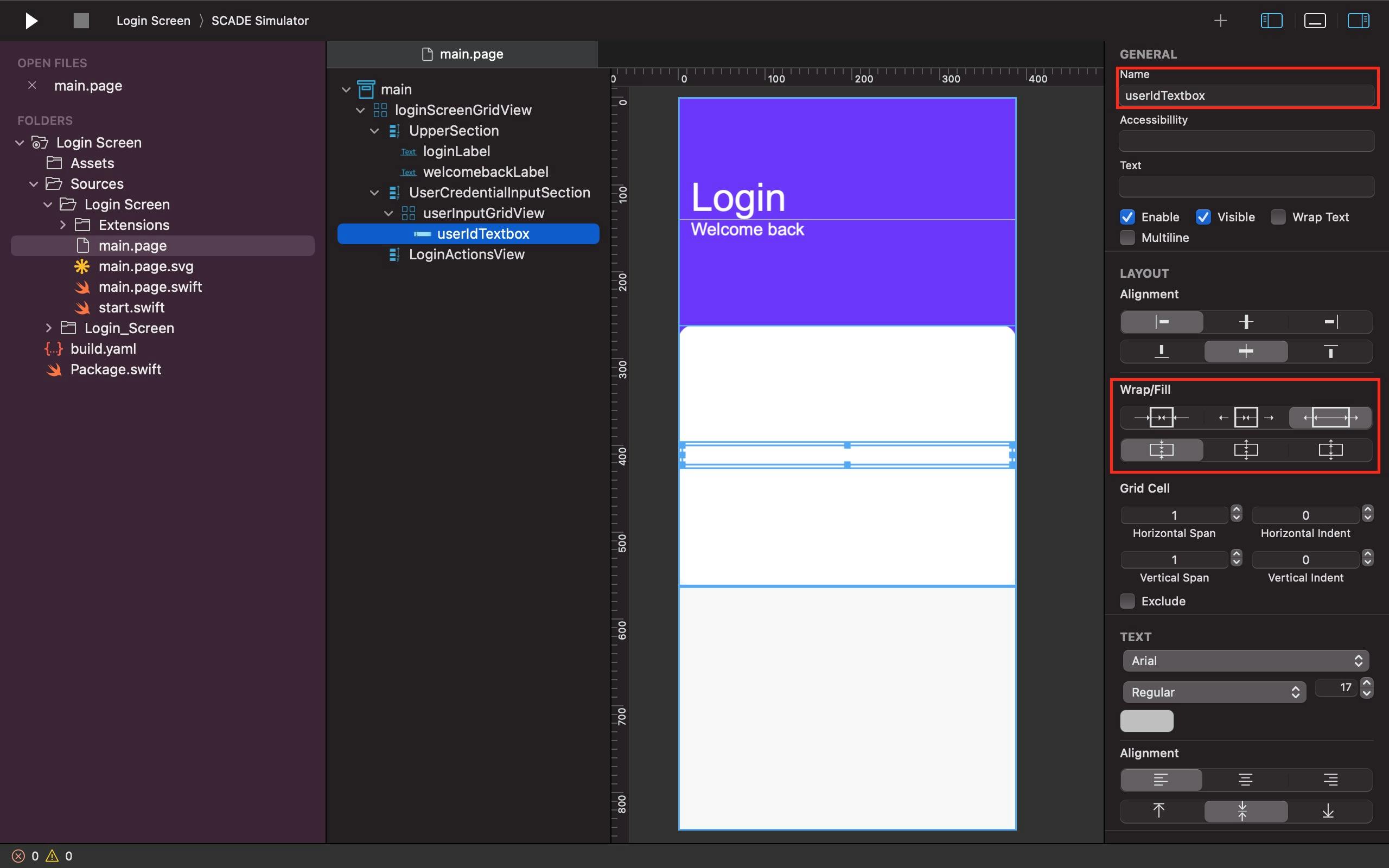
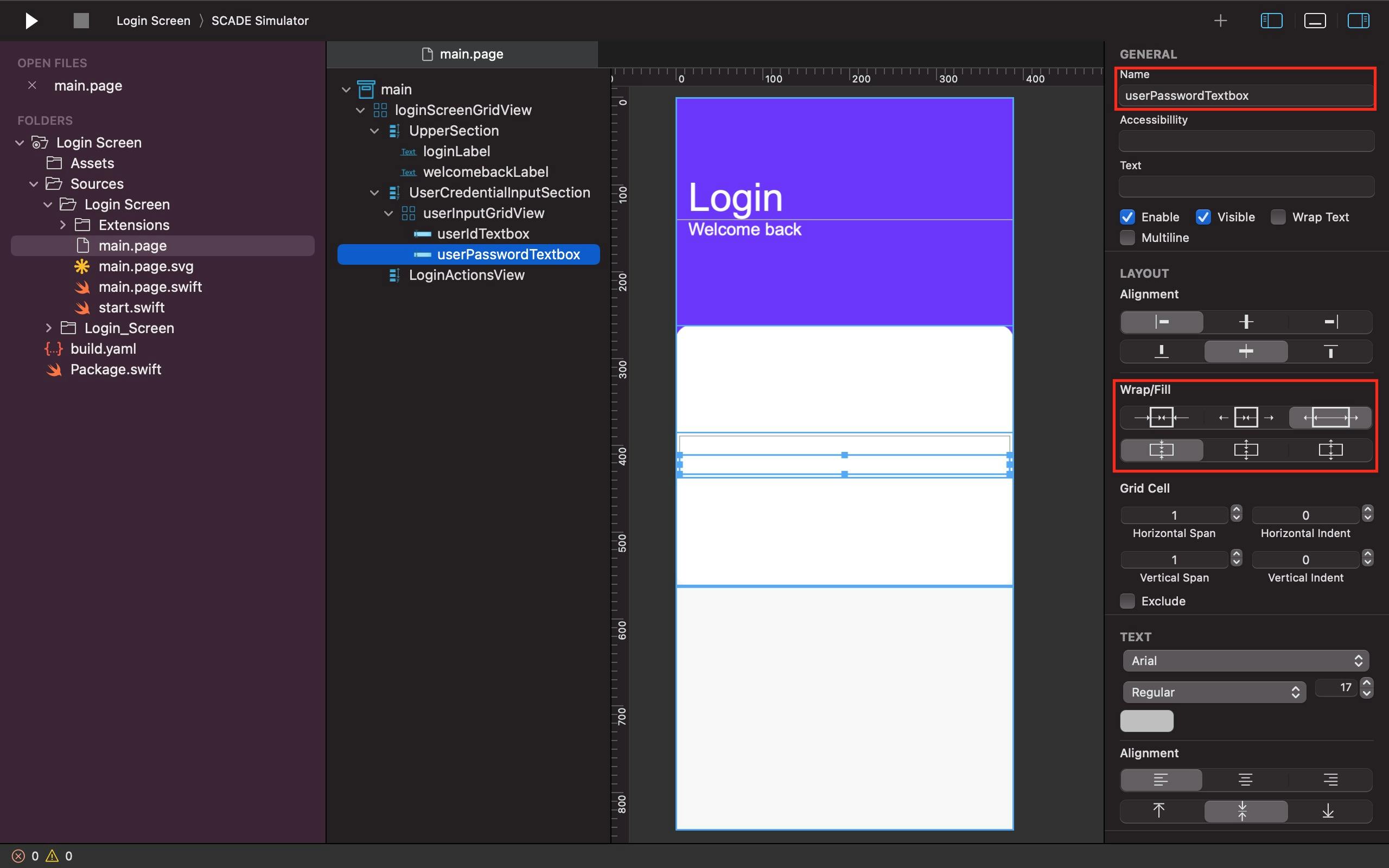
Use the Placeholder property to add a specific hint regarding user input in the two textboxes. The placeholders for userIdTextbox and userPasswordTextbox were "Email or Username" and "Password" respectively. Not to mention that we provided both textboxes a colored border width of 5 and that the Text Alignment attribute for each of them allows the placeholders to be drifted farther to the left and be confined nicely in their respective textboxes.
See the Screenshots below as a Guide:
We used the userInputGridView to improve the look and feel of the design by adding extra left and right margins and 20 Row Spacing to the userIdTextbox and the userPasswordTextbox.
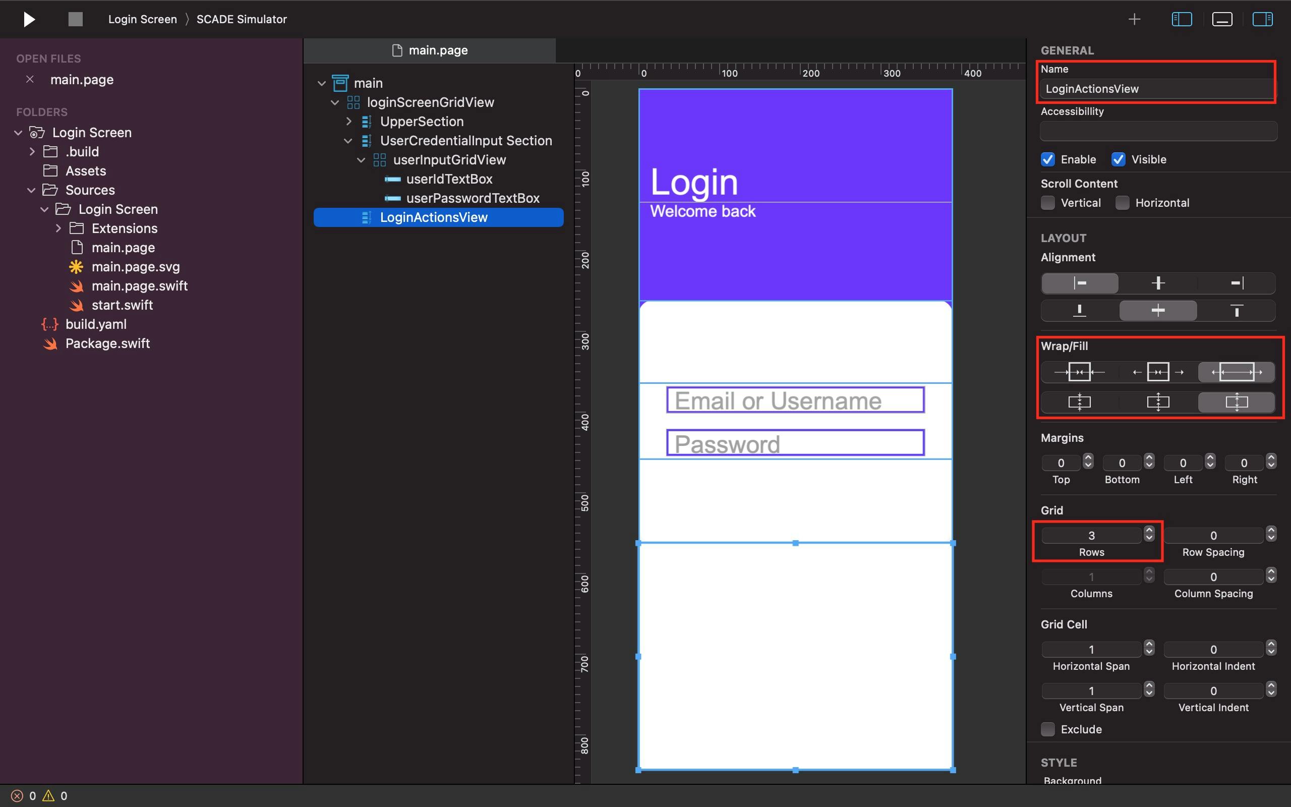
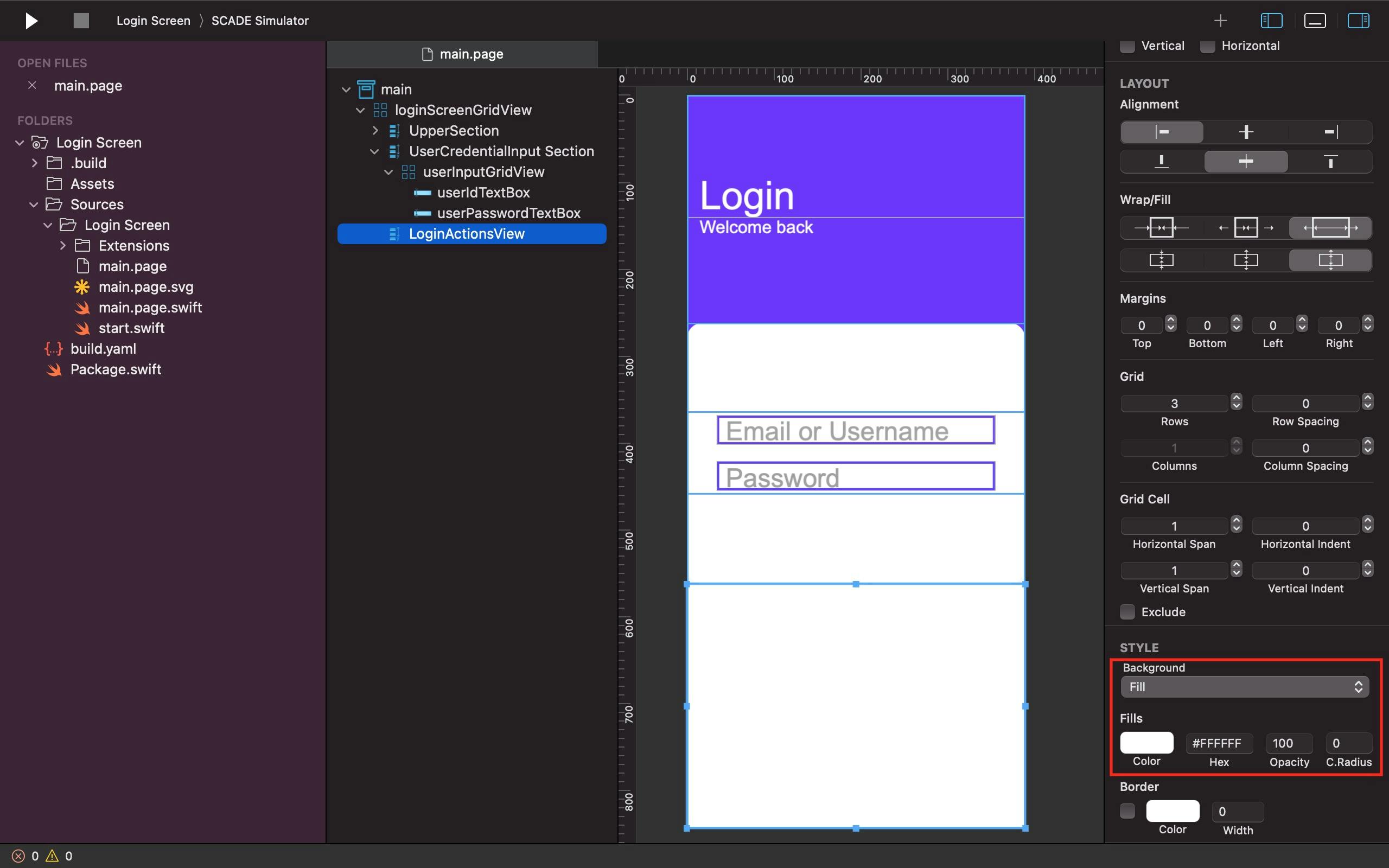
Step Four: LoginActionsView
We added a third vertical container to the loginScreenGridView and named it the LoginActionsView, as indicated previously in this tutorial. We made its background white, had it occupy all maximum space in the third row of the loginScreenGridView, and divided it into 3 rows to accommodate the forgotPasswordButton, loginButton, and signUpRowView.
See the Screenshots below as a Guide:
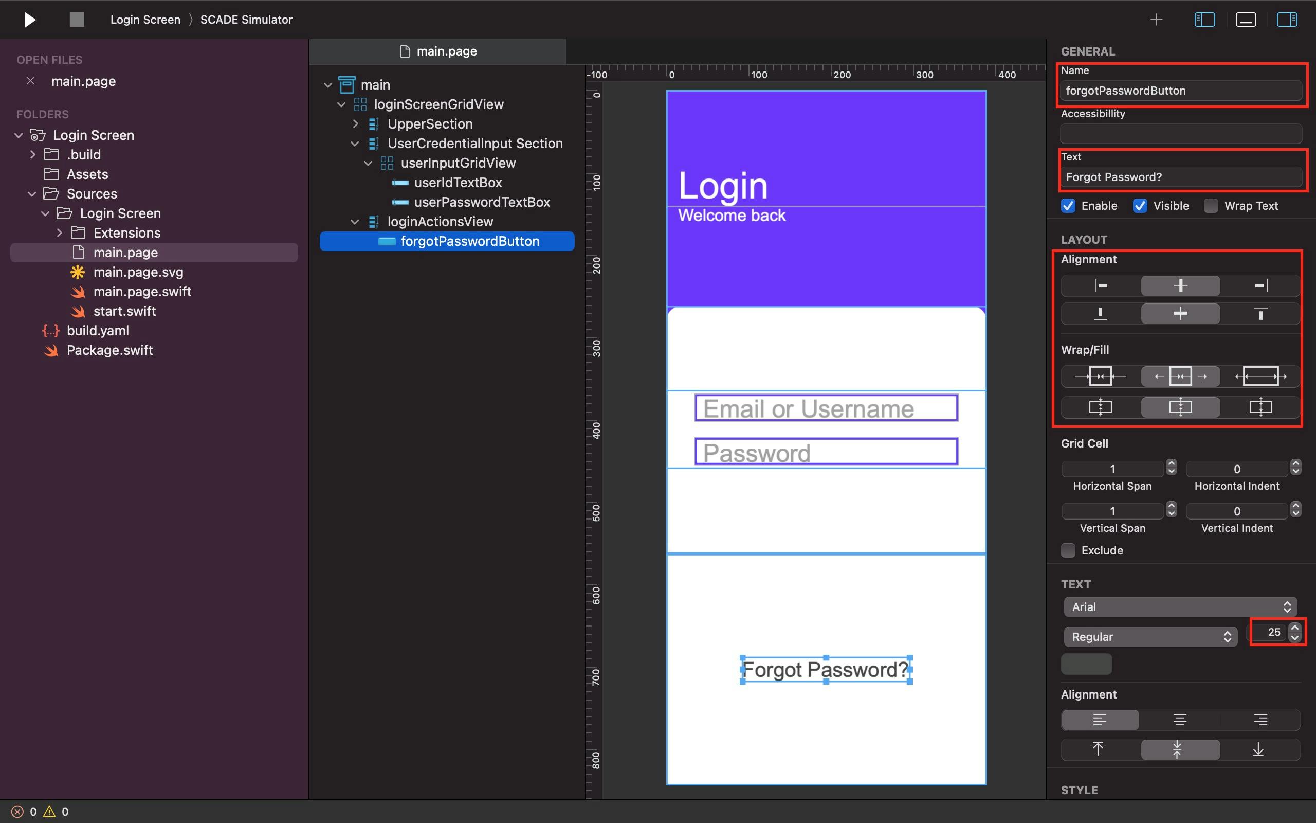
The forgotPasswordButton is centered inside the first row of the loginActionsView thanks to the Alignment parameter. Unlike before, we only gave the forgotPasswordButton in the loginActionsView a limited amount of space based on its Text size via the Fill property.
See the Screenshot below as a Guide:
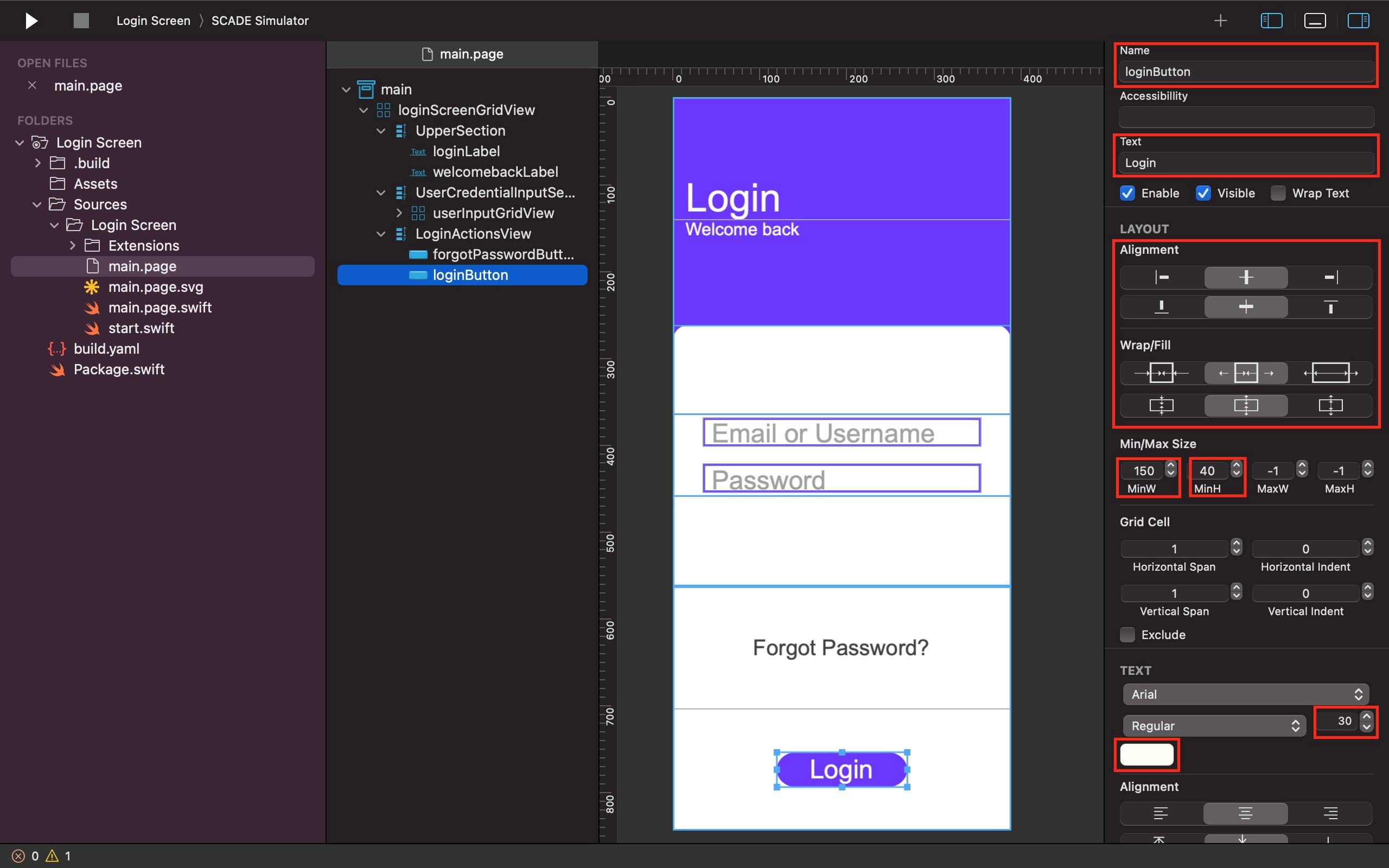
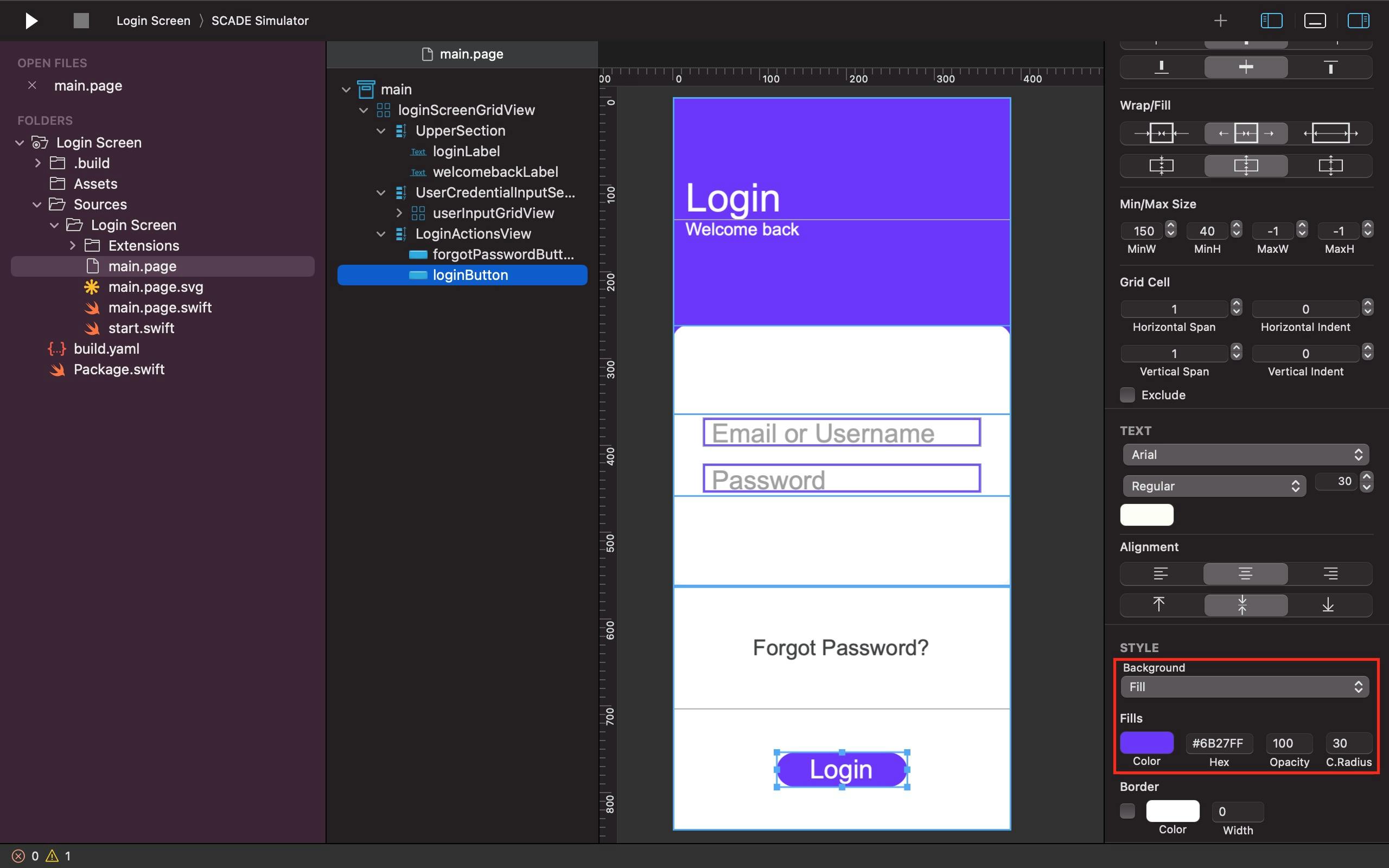
The Alignment and Fill attributes are used to set the loginButton in the same way as the forgotPasswordButton above it (in the loginActionsView container), with the exception that the loginButton has a larger text size, a different color text, a colored background, and a circular radius of 30.
See the Screenshots below as a Guide:
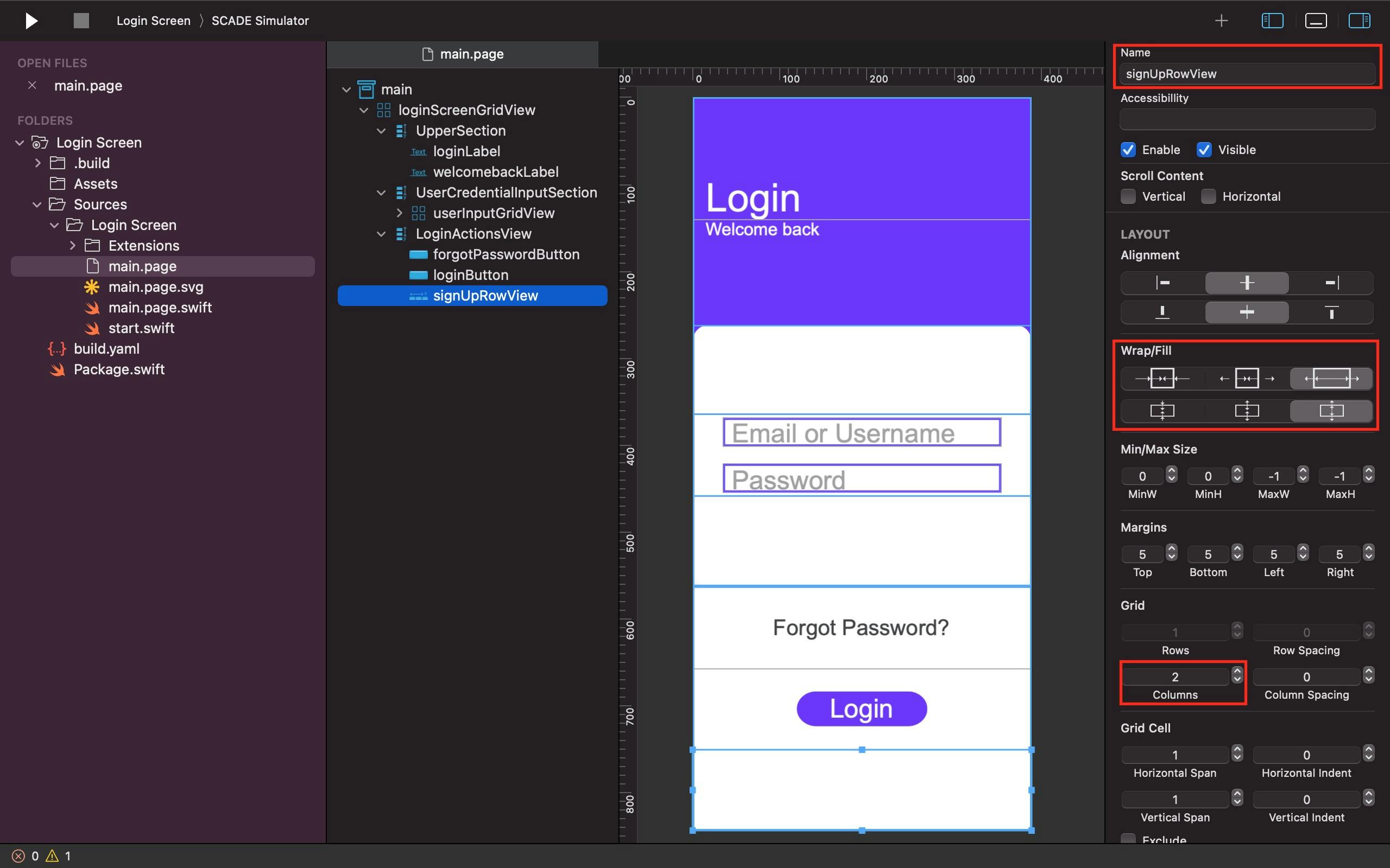
The horizontal container is an ideal go-to tool for placing two items or widgets beside each other horizontally. Inside the third and last row of the loginActionsView, we put a horizontal container, divided it into 2 columns, and name it signUpRowView to accommodate the notAMemberLabel and signUpButton. We use the signUpRowView Fill property to set it in a way that it would maximally get all the remaining space left in its parent widget.
See the Screenshot below as a Guide:
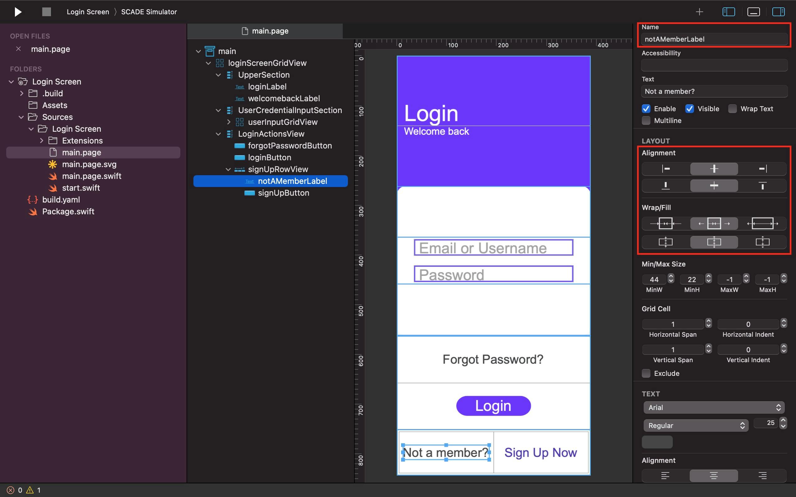
We use the Alignment and Fill parameters of the notAMemberLabel to set it such that it takes up all the available space in its parent widget.
See the Screenshot below as a Guide:
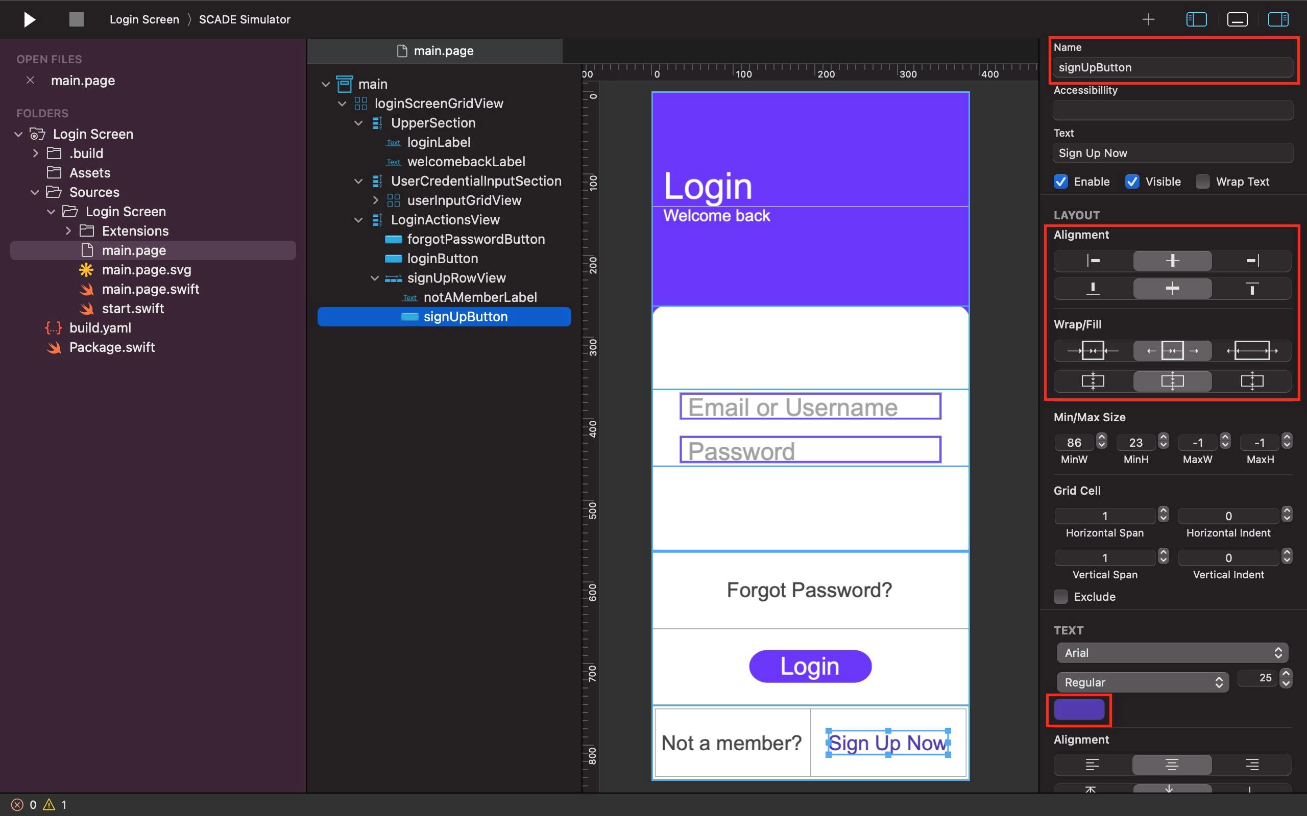
The signUpButton has essentially the same configuration as the notAMemberLabel, except for its text color variation.
See the Screenshot below as a Guide:
Final Output on iOS:
Final Output on Android:
Conclusion
This is a simple SCADE application that shows how to use the Grid layout to build a Login screen. Most of the widgets used, such as Gridlayout, Button, Label, and Horizontal container, are contained in Vertical containers within the primary Gridlayout. You may change the colors, margin, texts, labels names and sizes, or backgrounds, to match the theme of your application.
Here is the Github link for reference: https://github.com/Cdf-creator/Login-Screen-with-a-GridLayout.