
How to Copy and Paste Figma Design to Build Cross-Platform Mobile Apps on SCADE


Developing a successful mobile application is not simple; there are many factors to take into account, including planning, designing, coding, testing, and maintenance.
In this tutorial, we are going to look at one page of an existing app project on Figma and learn how to copy and paste the design into a project on SCADE. Figma is a well-known web-based vector graphics editor and prototyping tool that lets designers and software developers construct the user interface and wireframes for websites and mobile applications.
It's not always advisable to launch SCADE right away while developing an app. You’ll want to work on the app’s look and feel before doing any code. One of the reasons is that design plays a crucial role to get a user-friendly application. It is what makes using the app a seamless experience for the users. Additionally, by doing this before you start coding, it will enable you to figure out exactly what your app will perform. Once you are done with the design, you can then match the designs on SCADE.
By the end of this tutorial, you should have solid knowledge to do the following:
- Work with Figma designs on SCADE.
- Use the GridLayout to build a Responsive Mobile UI.
- Be able to Create Mobile Apps by Copying and Pasting SVG Contents from Figma into the Button Widget, and that the SVG Designs preserve their Original Size when doing so.
Getting Started
For the Profile & Settings page in this tutorial, we will use the GridLayout, which gives us the flexibility to have complex layouts that are highly responsive without having to worry about working with constraints:

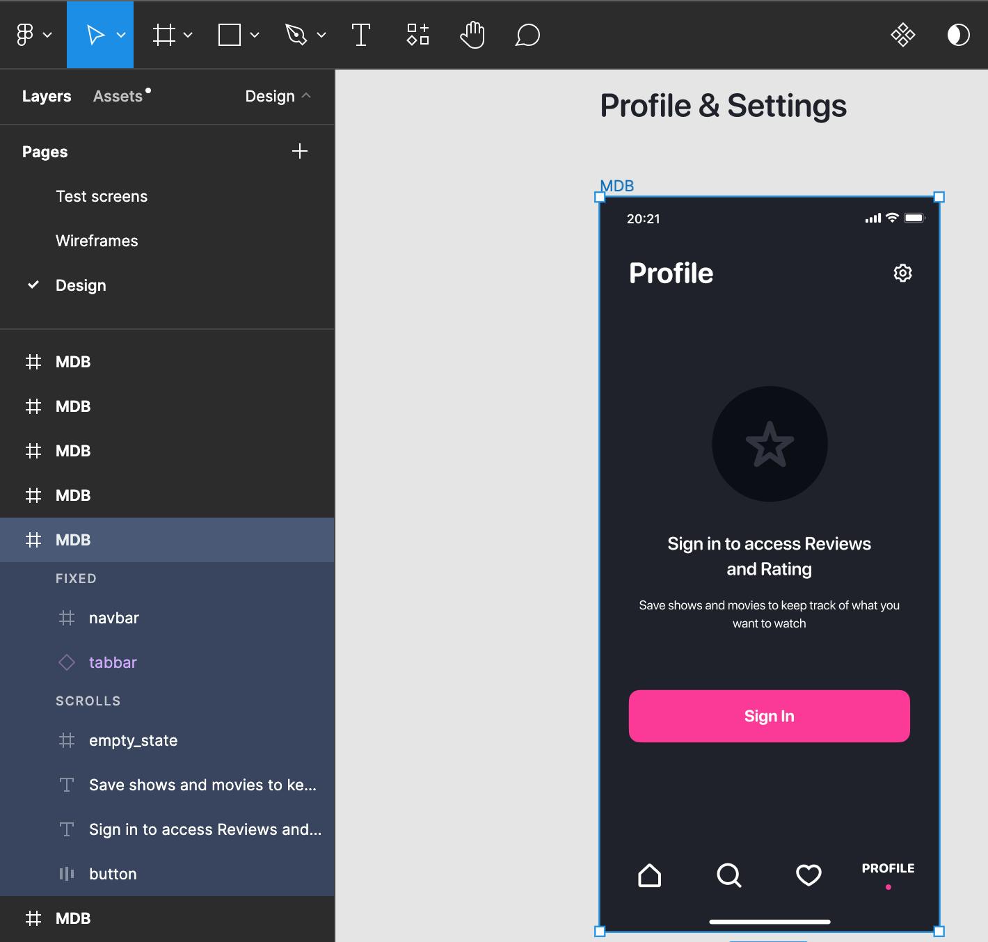
The Profile & Settings page below is the Figma design we'll be replicating on SCADE in this tutorial:
SETTING UP THE BASIC STRUCTURE
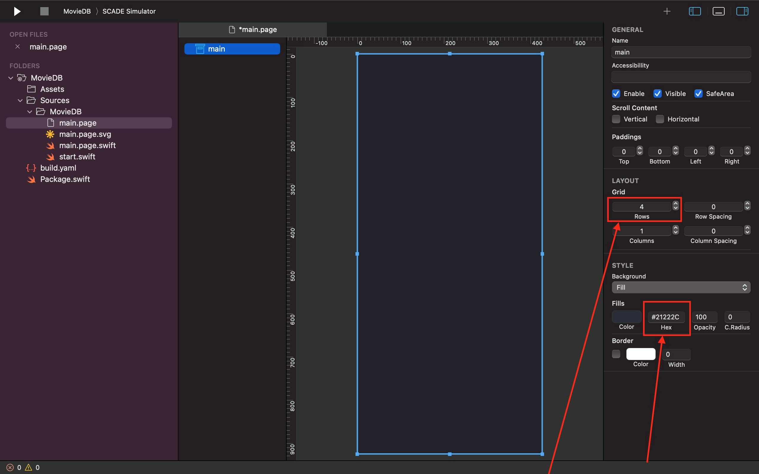
Open your project and click on the main.page file to set up the bare bones of our basic structure before we enter the details of our page.
Next, change the Row value of your Grid to 4 under LAYOUT on the right side of your main page. Additionally, paste the Profile & Settings page's background color's hex code copied from the Figma design into the main page background's Fills Hex field:
1. CREATING A CUSTOM NAVIGATION BAR
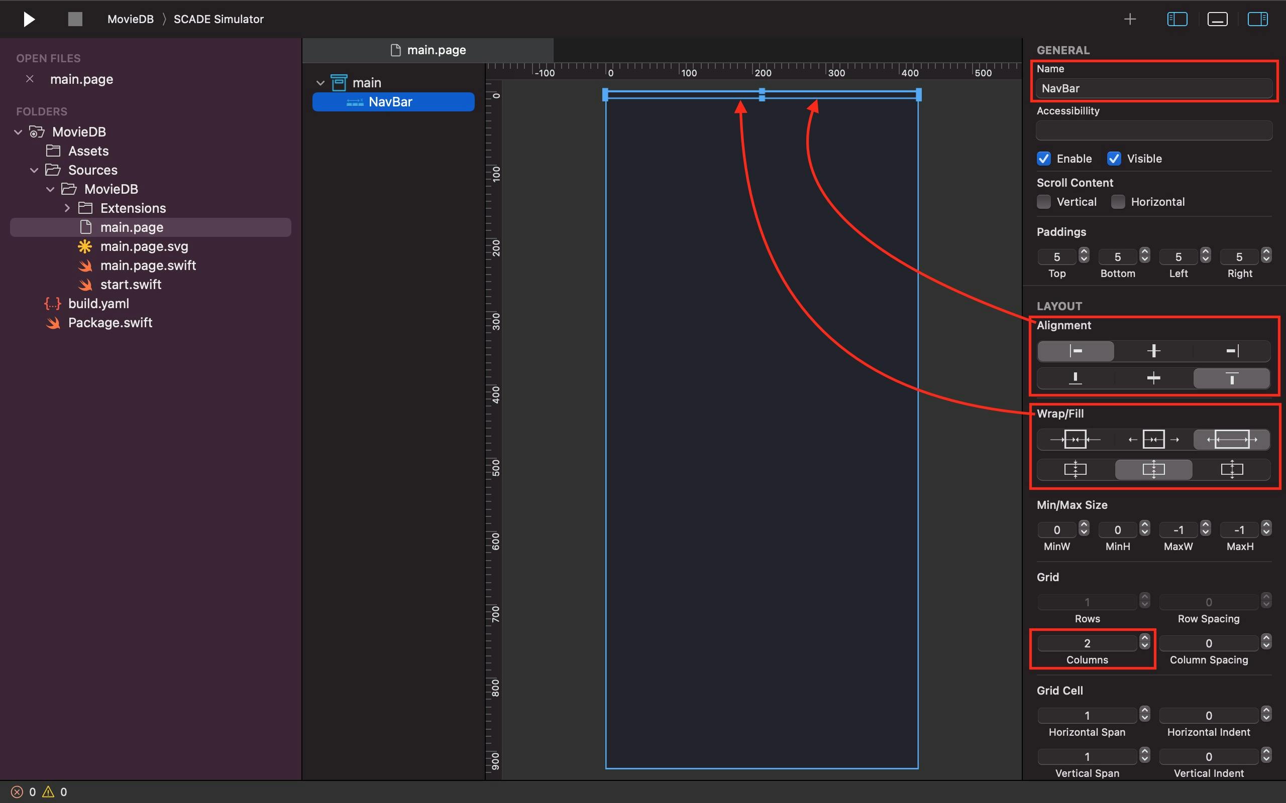
Looking at our Profile & Settings design, we need to create our custom navigation bar at the top. This is made feasible by adding a horizontal container in the first row of the divided main Grid and having its name updated to NavBar. That's not all, we also need to divide the NavBar into 2 columns, and use its Alignment and Fill properties to ensure that it only occupies a limited amount of space at the top of the screen:
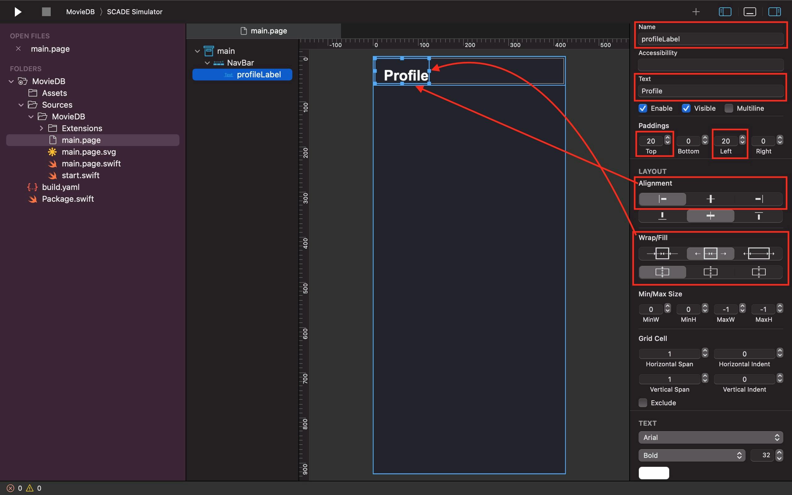
Next, let's add a label with the name profileLabel to the first column of the NavBar. we also need to give it a label text called "Profile". Also, the Alignment and Fill properties are needed here to configure the profileLabel to the top-left side of the screen with 20-padding ensured at the top and left side of it:
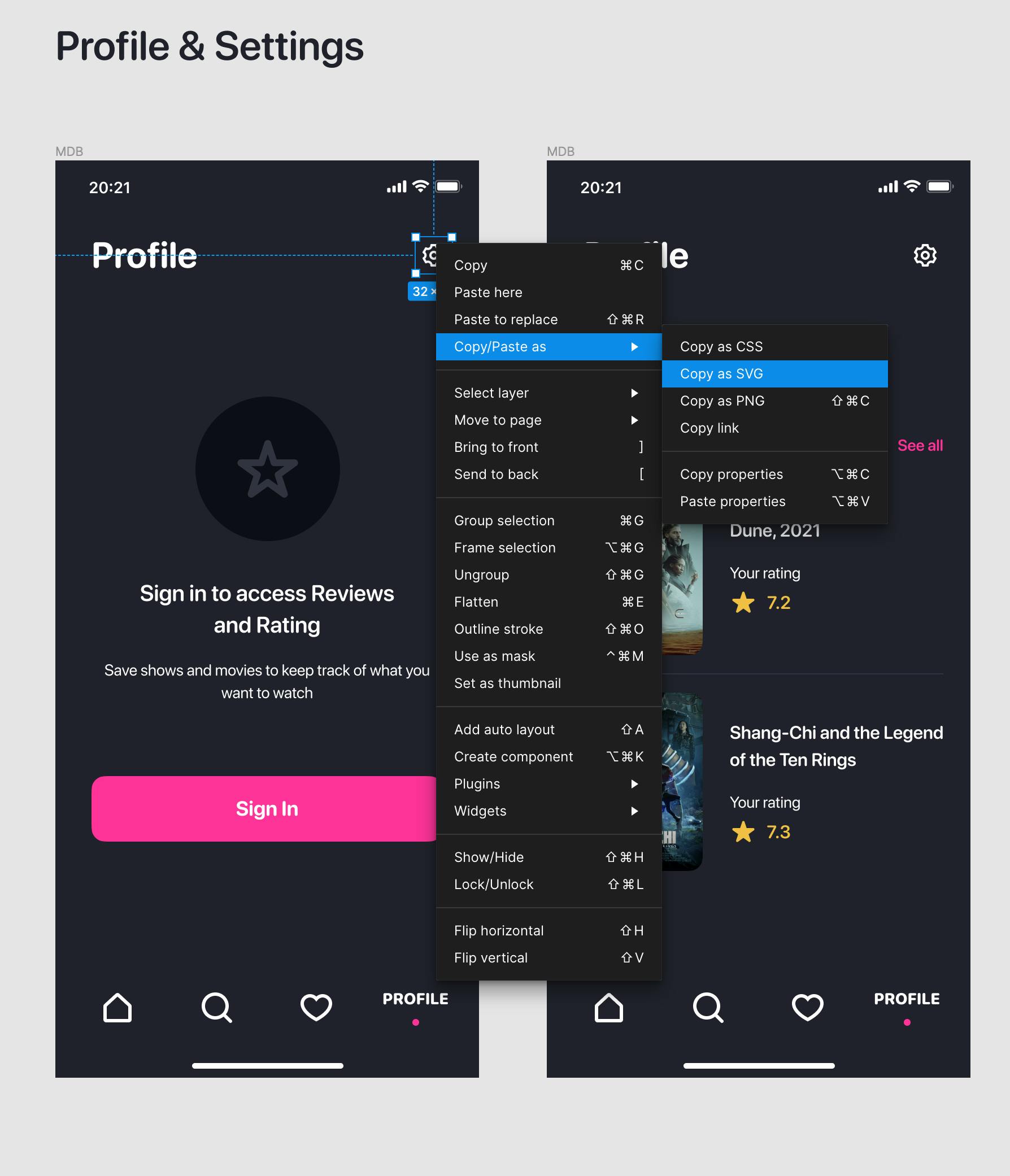
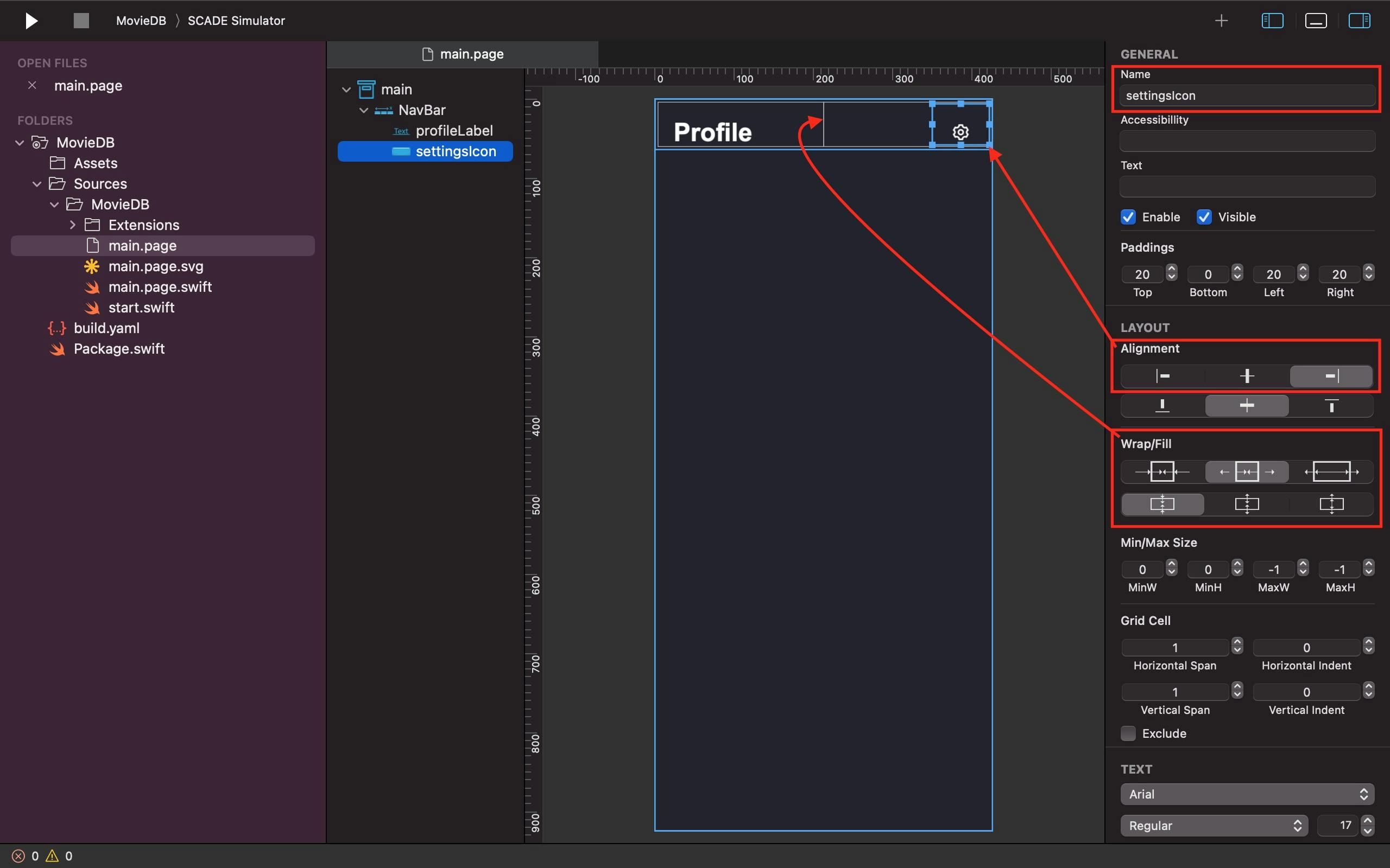
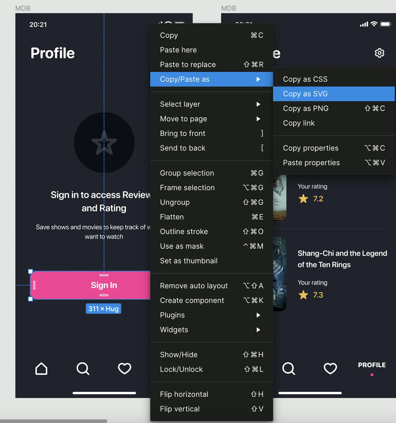
In the second column of the NavBar, we add a button widget beside the profileLabel and name it "settingsIcon". Just like the profileLabel, we need the Alignment and Fill properties to set the settingsIcon to the top right corner of the screen. The settingsIcon, however, doesn't require a text title, background image, or fill color. What is needed on the button widget here is to select and right-click on the settingsIcon on the Profile & Settings page of our Figma design, then go to Copy as - Copy as SVG. Once that’s done, you can paste the SVG icon on our settingsIcon button of our project on SCADE by using the keyboard shortcut command + V or the "Paste" option from the Edit dropdown menu on the SCADE menubar placed in the top-left corner of the screen:
2. ADDING AN UPPERSECTION
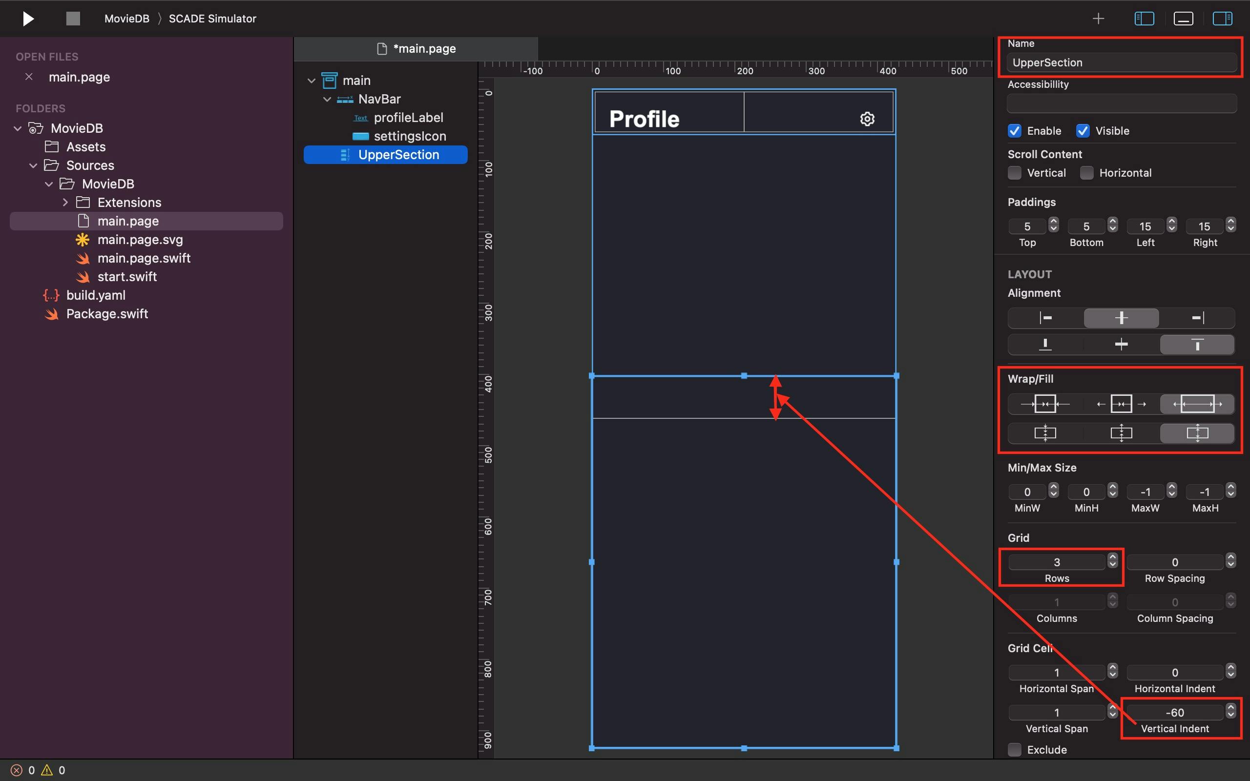
After finishing the navigation bar, let's add a vertical container and give it the name "UpperSection" to the second row of the divided main Grid. Notably, we are also creating three rows in the Uppersection to accommodate three items: a second SVG icon and two labels. We are using the UpperSection Fill property to configure it to occupy as much space as it can take. Not only that, but we also set its Vertical Indent property to a negative value so it can stack over the space of the preceding navigation bar:
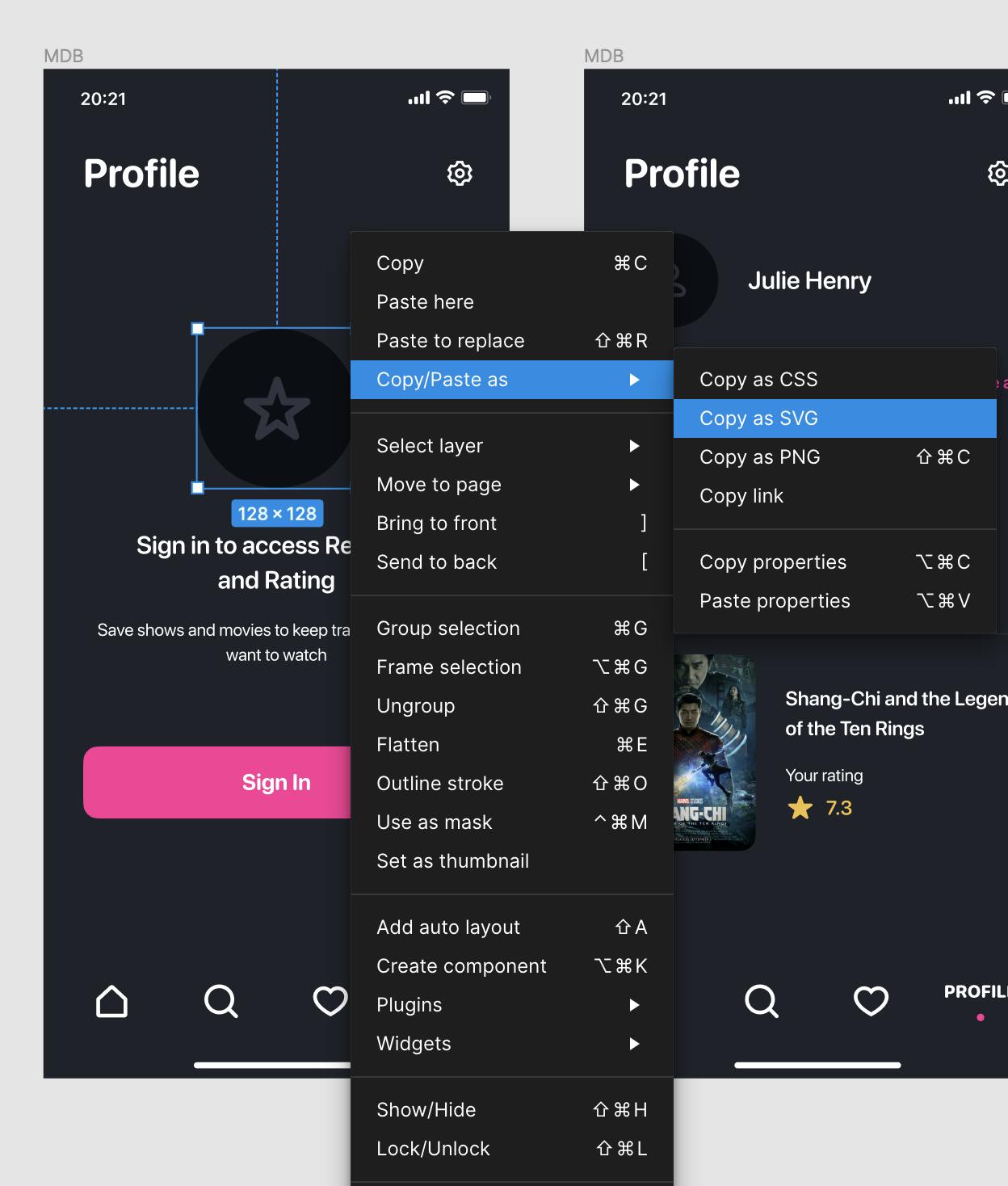
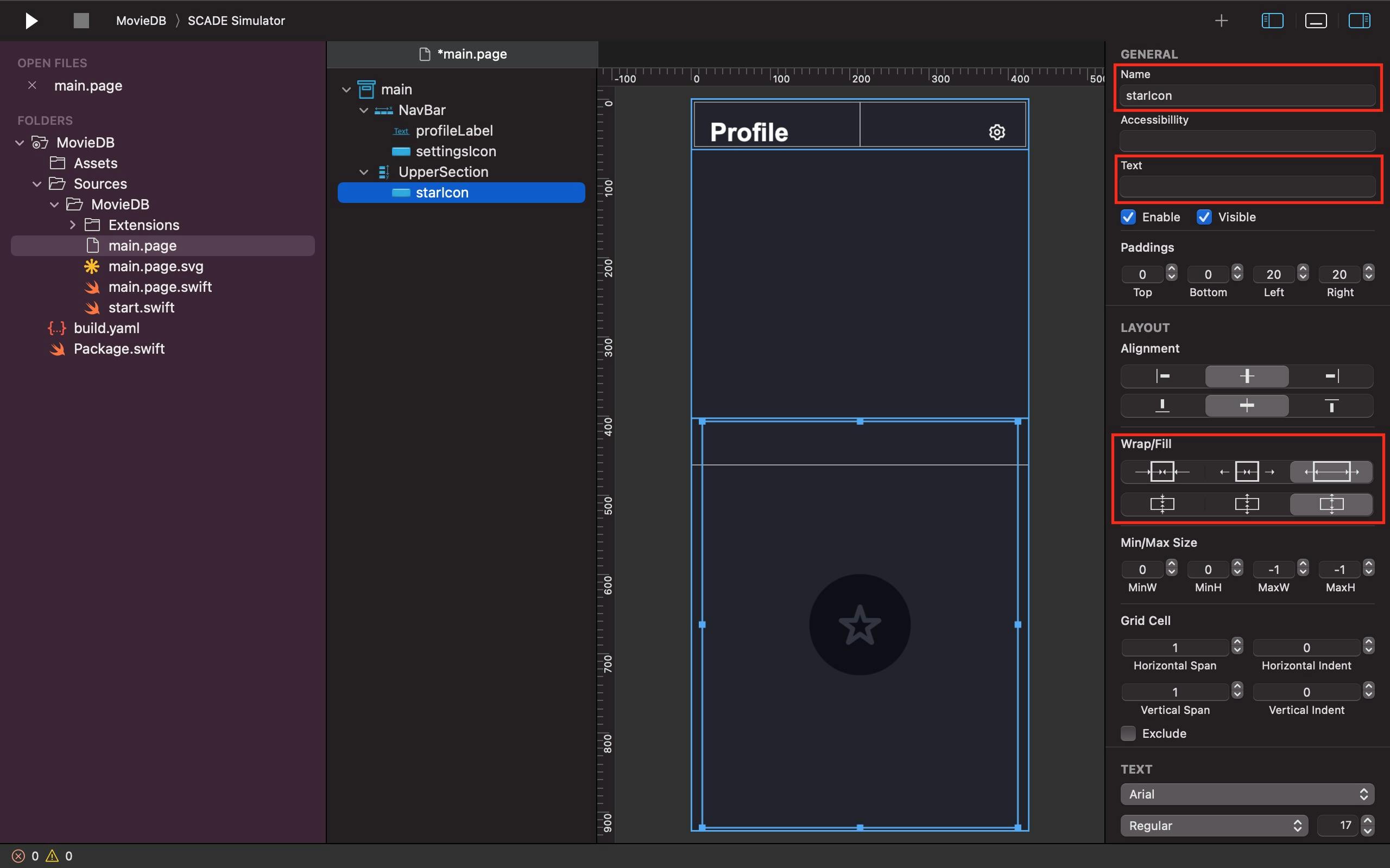
We return to our Profile & Settings page design to select and right-click on the circle star icon, then go to Copy as - Copy as SVG. Once that’s done, we add a button widget, name it "starIcon", in the first row of the UpperSection without a text title, background image or fill color and paste the SVG icon inside it by pressing the shortcut command + V or selecting "Paste" from the Edit dropdown menu on the SCADE menubar in the top-left corner of the screen. Additionally, we use its Fill parameter to make sure it occupies all available space:
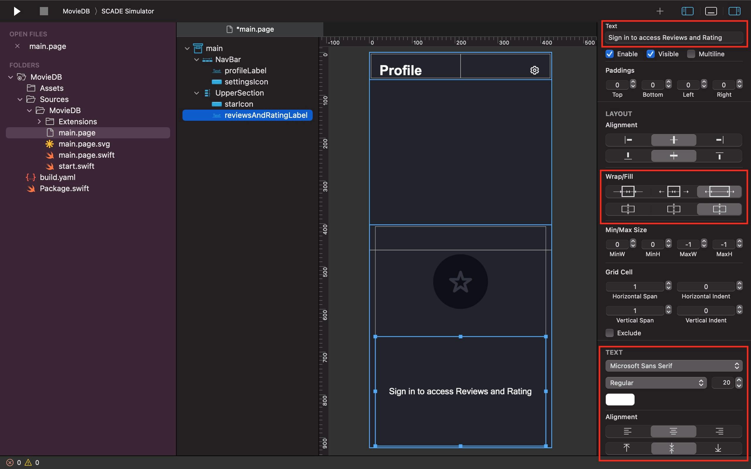
We add a label in the second row of the UpperSection named "reviewsAndRatingLabel" that outputs a text about having access to Reviews and Rating. we give it a fontsize, font-type and also use its Text Alignment property to make it centred. Thanks to its Fill property, we ensure the reviewAndRatingLabel occupies all the available space within its control:
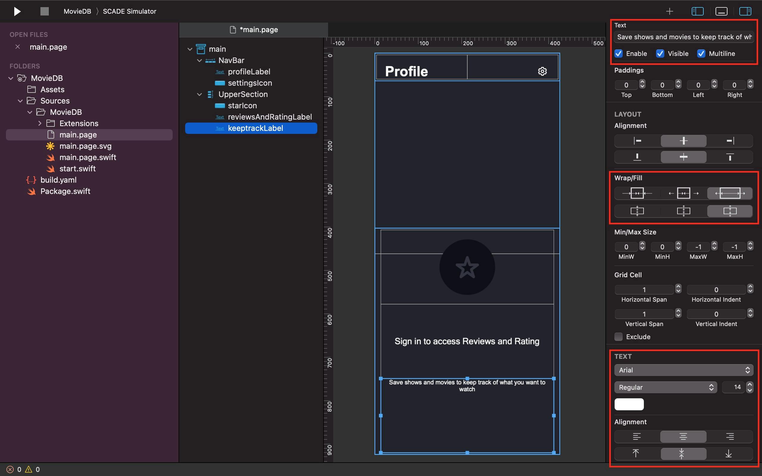
The last row of the UpperSection takes another label named "keeptrackLabel" that returns a text emphasizing keeping track of shows and movies to watch. We give it the same treatment as the reviewsAndRatingLabel above except that we make its texts multi-line and reduce its fontsize to 14:
3. ADDING A SIGN-IN BUTTON
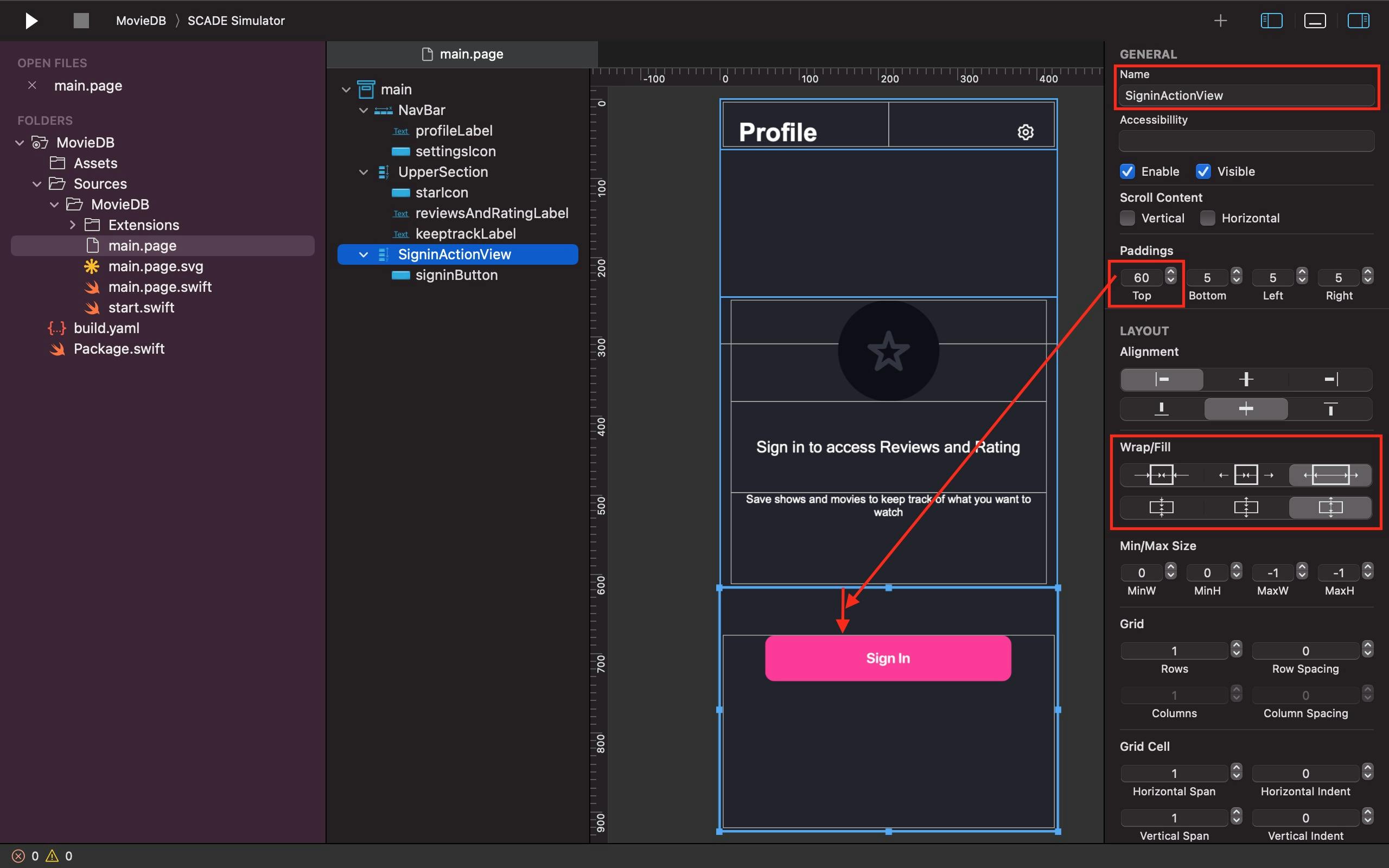
We add a Vertical container with the name "SigninActionView" and top padding of 60 in the third row of the divided main Grid to accommodate another button widget. It's important to note that the SigninActionView is also set up to take up the most amount of space possible:
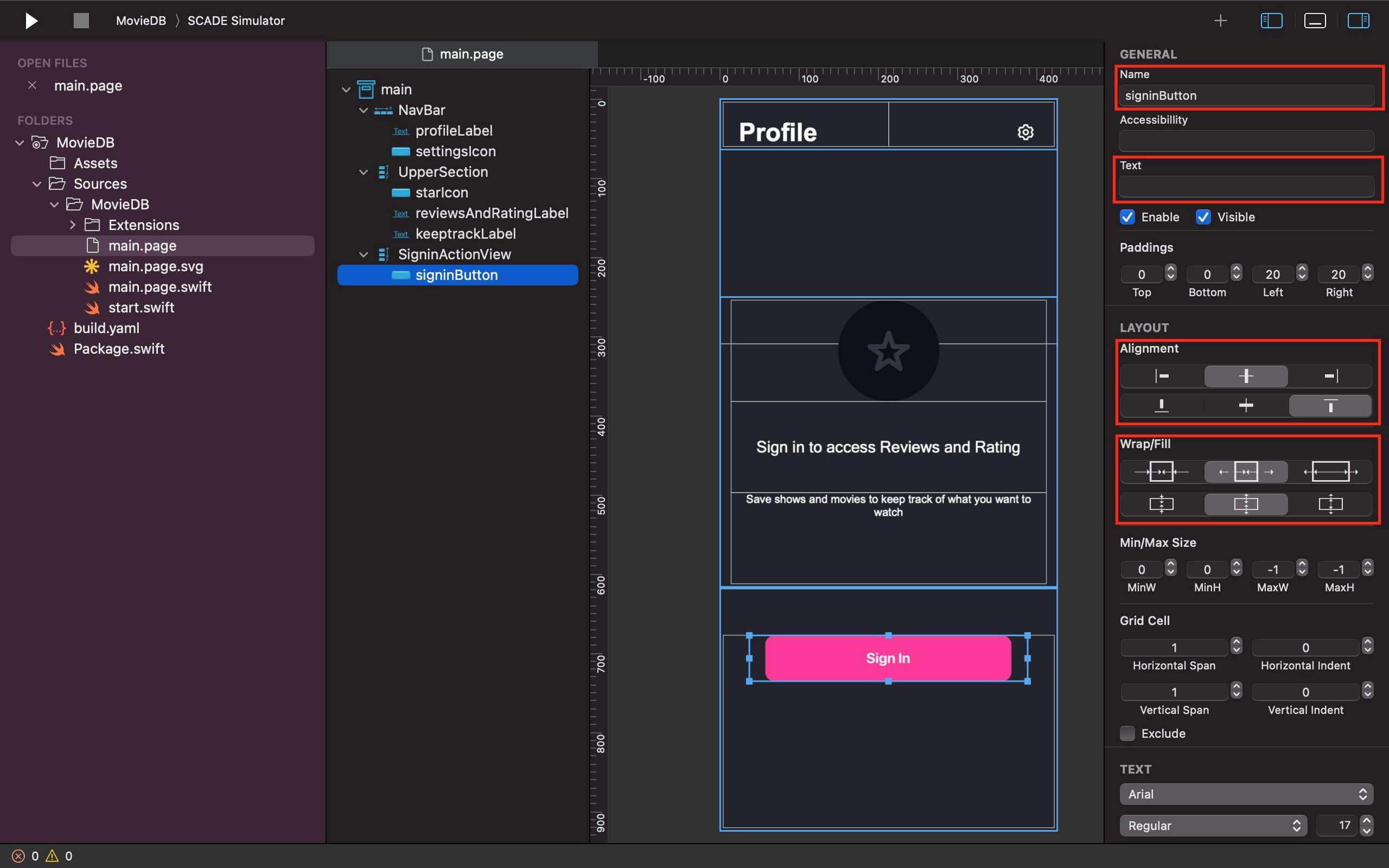
Inside the SigninActionView, we add a button widget and name it "signinButton". We need the signinButton's Alignment and Fill properties to set it to the top center area of the SigninActionView. As usual, like other button widgets used in this tutorial, the signinButton, however, doesn't require a text title, background image, or fill color. All we need do is to select and right-click on the signinButton on the Profile & Settings page of our Figma design, then go to Copy as - Copy as SVG. Once that’s done, we then paste the SVG icon on our project signinButton on SCADE by using the keyboard shortcut command + V or the "Paste" option from the Edit dropdown menu on the SCADE menubar in the top-left corner of the screen:
4. WORKING WITH A TABBAR
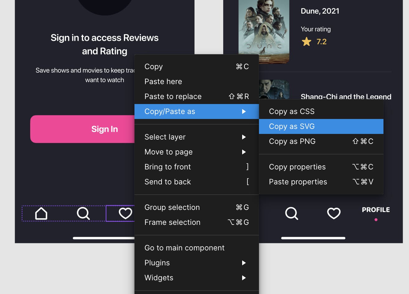
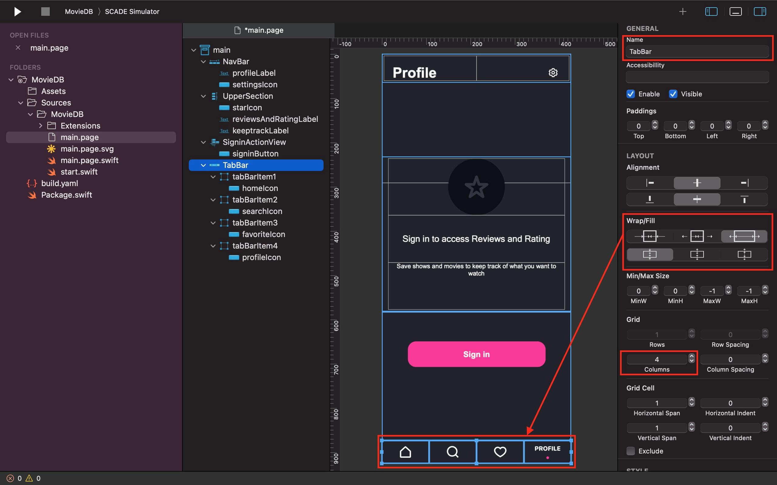
We divide a ToolBar named the TabBar into 4 columns to accommodate the home, search, favorite, and profile icons. The TabBar's Fill property is used to configure it to sit at the bottom of the last row of the divided main Grid. How are TabBar's four items added? Just like we have done for all the icons we have used so far, we add a button widget into each of the tabBarItem and simply select the four Icons from the tabbar on our Profile & Settings design page and right-click on them, then go to Copy as - Copy as SVG. Once that’s done, we then paste the copied SVG icons into their respective button widget by using the shortcut command + V or clicking on "Paste" from the Edit drop-down menu on SCADE menubar at the top-left corner of the screen:
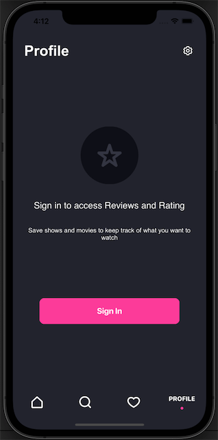
Output on iOS:
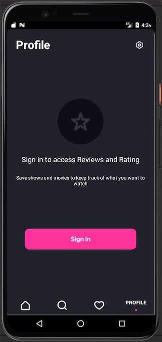
Output on Android:
Conclusion
This tutorial taught us how to bring a Figma design into SCADE. We’ve also learnt how to look at a design and figure out what components it has. Then, we added all the components of the design into pages (such as main.page as an example) and updated them to match the Figma design. We've also learnt how to use the GridLayout so that the design looks good on any device. Lastly, we also learnt how to copy/paste designs from Figma into the button widget and observe these SVG designs maintain the same size as those on Figma. The source code for this tutorial is available on GitHub.
Please note that this tutorial is based on SCADE 2.0.54, which only supports copyng and pasting designs and icons into the button widget; future releases of SCADE will have support for all widgets.